Greetings from Andi via the Critique Club and my first Critique from the 57,000 missed requests, its fitting thats its also your first ever submission Juliet! (btw, this image is almost .7 above your average to date!
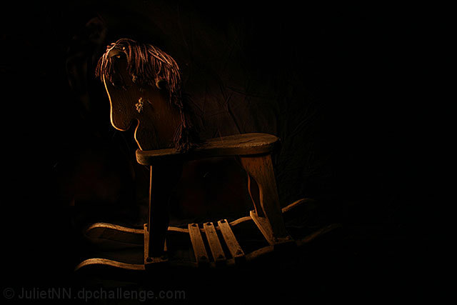
First Impression: I can't believe nobody called you a 'dark horse' for entering this. My monitor is a little on the dark side so yes I lose some detail but moving to one side I can see much more and sadly the crumpled background cloth (am guessing it wasn't meant to be seen crumpled?)
Composition: Well, its not central but think it would have more impact with more negative space on the right and top of the image.
Subject: A great choice for the challenge and reckon it took most viewers back to their childhood regardless of them owning one or not ,your title is perfect
Technical: Well, I think your commenters said it all, its all in the lighting and think you scored well considering.
Final thoughts: Well Juliet, 18 months on I wonder what you think about this image? I'm pretty sure you like it and 'monkey man' here (private joke) is challenging you to reshoot this image using the skills you have learnt here at dpc to improve the shot. SDo, back in the garage, finish that bottle of gin and suprise me!
Great low light shot! Thanks for the kind comments on my current challenge picture (to remain hidden for now). Top 20 on your first challenge? I guess the gin is the secret that I haven't tried yet. I'm still trying to keep in the top 50%.
Thats all right, I will give myself a blue, yellow and red ribbon, hehehe, it does seem that about 53 people where not impressed, would have loved to have heard from them on what I could have done better! (lighting hehehe)
Good, though a little too dark, and I'm viewing it on a fairly new and calibrated monitor right now.
A huge part of the problem here is that too much JPEG compression is killing the details. Your file size is only 22k, and you could have used up to 150k in this challenge. Always used the lowest level of compression (resulting in the largest file and greatest detail) that will sneak in under the limit for a challenge.
Oh wow, absolutely brilliant find I don't think rocking horses are made of wood anymore? I think they have tried to make it fancier these days, the lighting is so moody, the sepia tones suits this perfectly very nolstagic! Well done10
Nice shot. Came out a bit too dark on my computer screen. A bit hard to see the detail. Again it could be my equipment. Great idea and composition. (6)
I know the darkness adds to the mood of the image and is great, its perhaps a little too much. Perhaps making the highlights more powerful by visiting either Levels/Curves would have been enough to give this more impact. The composition seems a little odd though, placed a third in from the right (as it is facing left) would have been spot on for me. Nice and simple though with no distracting background elements.






 Add photograph to your favorites
 Add photographer to your favorites

 Photographer found comment helpful.


