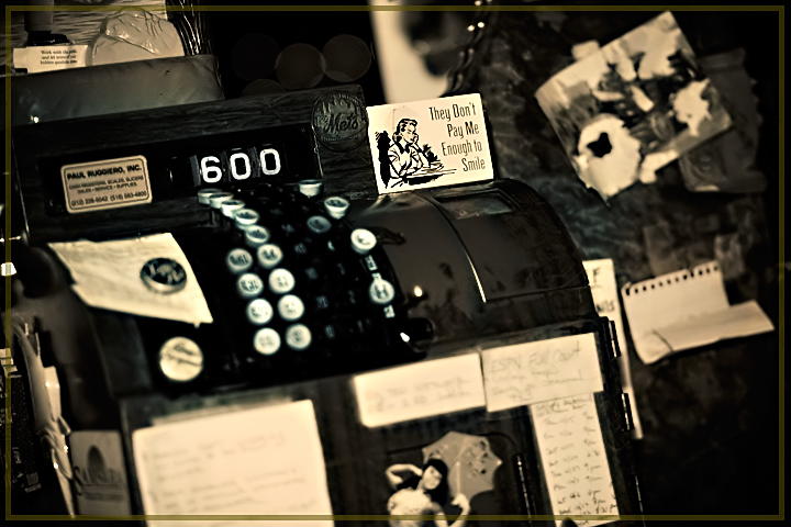
Hmm, I'm struggling to find a 'point' to the pic even though I like the imagery. It might be the distraction of the stuff to the right of the register that is distracting
Your image is busy to my eyes and they keep focusing on the business card size sign and not the 6 on the register itself. I do like the tonal values you chose.
i really like this one (the signs, the nostalgia and the throwback cashregister) except for one thing - the sepia throughout most of the image is very good but the color change around the keys is the only thing that seems odd to me - was this burned/ dodged after adding sepia?
This image has charm, I especially like all the little details scattered around the composition (otherwise known as "busy" :) ). The only thing that personally I find jarring is the border - I don't think it complements the image and just serves to distract.






 Add photograph to your favorites
 Add photographer to your favorites

 Photographer found comment helpful.


