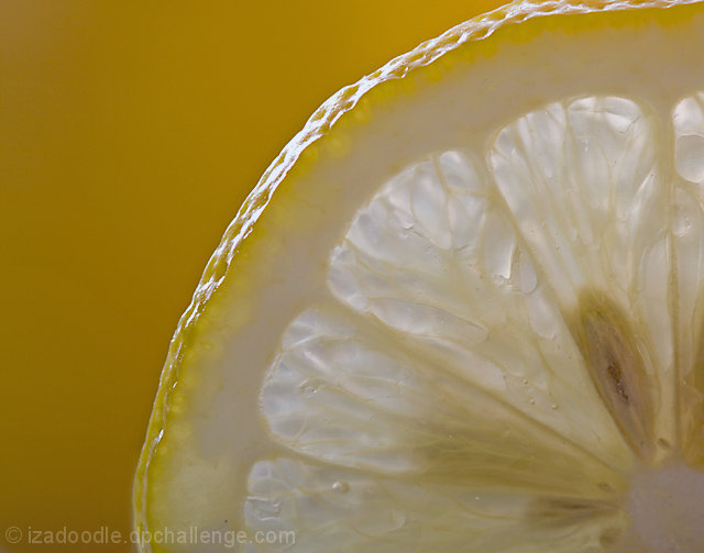
The background is filled with a more saturated yellow than the lemon. Given the lemon is the subject (combined with the yellow brief) I believe that it should be round the other way - stronger yellow on the lemon against a black background to maximise contrast. Pushing the levels at the top end to beef up the whites in the lemon flesh would have been another modification worth considering. Well composed although not particularly original concept





 Add photograph to your favorites
 Add photographer to your favorites


 Photographer found comment helpful.


