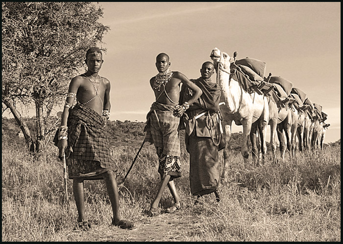
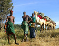
Several people have mentioned that they would like to see the color version of this picture. So I thought I should upload it. I went with the Sepia because I felt like it hid some of the flaws that I couldn't figure out how to get rid of (especially shadows on the warriors faces). I would be interested to hear opinions on whether the color version would have been a better choice. I seem to be making poor choices on which picture to enter and on editing and am always looking to learn.
Wow, that's a fantastic image actually. And I appear to have given it a 4 during voting. Sorry, on second look, that was actually very unfair of me.
To explain why - it was something about the post-processing. I think I briefly thought: "Oh, interesting image, but it's all a bit too monotone/sepia for me". And I barely even noticed that wonderful line of camels! (god, I feel bad now!)
So, yeah. Overall, I think the image is fantastic. Interesting subject matter, you've got spot on focus with pretty much a vanishing point of camels emerging from it, it's wonderful really.
Post-processingwise, however, I think maybe the picture could do with a bit more contrast, and maybe some dodging and burning, or soft light layers, to bring out bits of it. I'd also consider chopping off a bit of the tree on the left, to make the viewer focus more immediately on the first boy in the line. And the sepia... Maybe it's a personal preference, I'm just not too keen on it. I'd be interested to see it in colour - Africa has such lovely tones... Or even plain B&W I think works. It's just, sepia sort of makes me think old 1920s shots, whereas this shot could be a lot more alive than that.
And on a finishing note - I love that first camel's smile!!!
Anyway, great pic, congratulations on your new top score, and I hope to see more amazing work from you in the future!
Remarkable angularity. The wall of camels is incredible. All the subjects are in fact lined up perfectly, pleasing to the eyes but so perfect as to be unsettling. I mean that in a good way.
Great composition and lines with the camels. The conversion to B&W is a little flat and the shadows are a little dull (image is a little overexposed)which may hurt your score. Needs some more contrast as well. Nonetheless, I great experience and image for anyone's collection. Good Luck. 5.
Amazing subject, very well captured, however the tone doesn't work for me... I think it's the association with Africa, that makes me feel it should be a little warmer :)





 Add photograph to your favorites
 Add photographer to your favorites



 Photographer found comment helpful.


