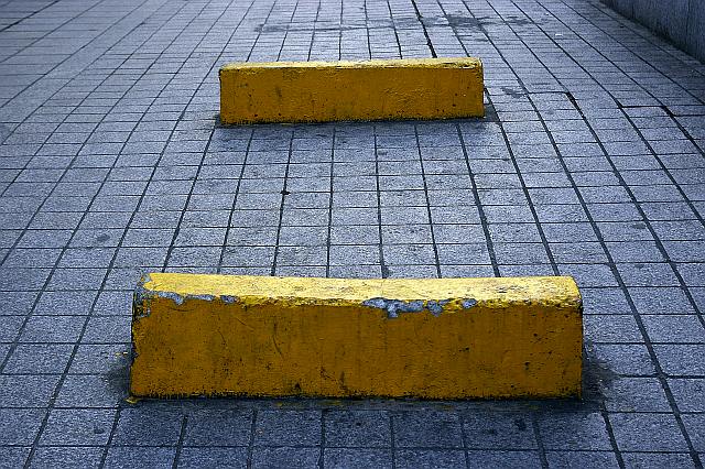
Experimenting with geometry.
Lightning was provided by the Sun above the clouds, on a late afternoon.
Processing: autoadjust color with Irfan View, because this is the only way I know how to do something about levels. Szturated a bit, filtered blue and red, contrasted, and sharpened, so that it can look cool.
Statistics
Place: 140 out of 273 Avg (all users): 5.1020 Avg (commenters): 4.8333 Avg (participants): 5.0122 Avg (non-participants): 5.1445 Views since voting: 713 Views during voting: 360 Votes: 255 Comments: 7 Favorites: 0
Thanks for the comments, votes and looking at this photo.
I tried getting rid of the wall on the right, but then these two yellow things became too big, overwhelming the image. I didn't want that. Vertical composition didn't look good either, although, now I'm thinking maybe I should not have had such a high point of view, but lower my body a bit. I should try again.
I wanted the title of the photo to be =, only =, just a graphic title like the image. But, the system needs an alphanumeric sign, so I had to add something that didn't take away from the geometry, so ended up with this stupid latin title.
Interesting work in patterns. I wonder if you had gone with a portrait orientation on your composition if you could have eliminated the wall on the right. This just feels like a vertical presentation would be stronger. Have NO idea what the title means. Good luck.
Yes... this has yellow in it. But for me I don't see something popping out of this image that can interest the viewer. If you have tried to depict the elements of design, there could have been some interesting composition rather.






 Add photograph to your favorites
 Add photographer to your favorites


 Photographer found comment helpful.


