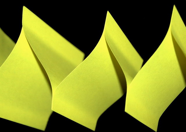
original. interesting to look at. I like the yellow against the black. A little out of focus. If all the lines against the black were sharp I think it would look better.
This is "ok". Not really jumping off the screen saying "Wow, look at that!". I mean, yes, technically it fits the challenge theme fine, but the subject is a bit bland. Did you consider putting a couple rows together, or maybe come in at a different angle. Cover the bottom of this image with your hand to eliminate the lower black area; look more intriquing? Just thinking out loud. Best of luck to you in the challenge.
Nice color, nice black background. Lighting seems a tad harsh with shadows. Maybe you intended that to highlight the form of the post-its. I think I'd like it better with softer, more even light.






 Add photograph to your favorites
 Add photographer to your favorites


 Photographer found comment helpful.


