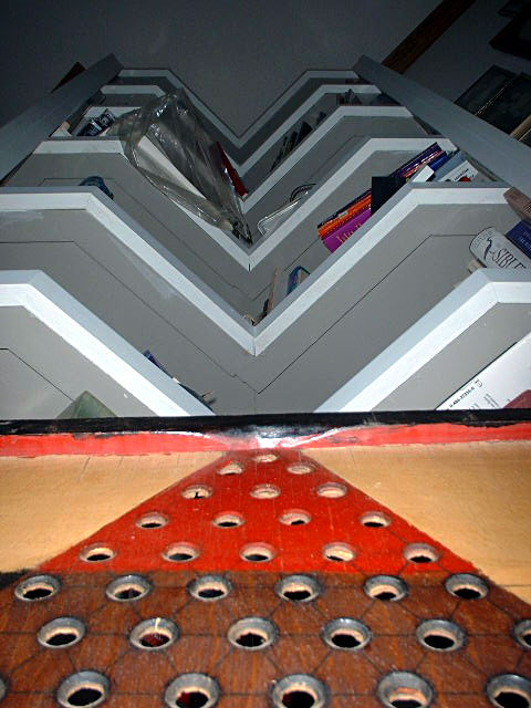
Initial=interesting geometrics Composition=like how the red triangle points up to the shelves above, which are also in a triangular position Clarity (focus, details)=Starts out well from the bottom, but due to the darkness at the top, the image becomes dithered. Perhaps some lighting at the top of the shelf would eleviate this. Exposure=fair Interesting or Emotive=the geometrics are interesting, but the plastic bag stops my eye from continuing to the top. The other items on the shelf are fine.
I am using a this new detailed commenting method inspired by autool. (Thanks autool!). I hope you find it more helpful than my former comments. Thanks for submitting, and good luck! ;0) kpb
I feel like I'm looking at two different photos here. The severe contrast between the top and bottom just confuses me. My eyes keep darting from one to the other.
I am rating this shot lower becuase this scene is not specific to your corner of the world. I can see the same setting here is CA. More planning and better positioning/lighting could have made this a better shot. 6
WAY too busy, and the horizontal lines, along with the angles drives the eye NUTS, IMHO. It looks like two photos, or a composition or ... I'm not sure what, but it hurts to look at it.






 Add photograph to your favorites
 Add photographer to your favorites


