Author Thread
Post actions
hey Tim, this is really nice.. where was it taken?
Comments Made During the Challenge
Post actions
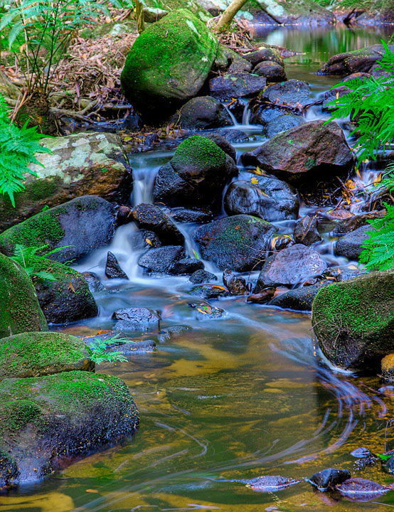
good composition, but turn the greens down!! :)
Post actions
maybe oversaturated but still prety
Post actions
Very nice composition but it looks oversaturated to me.
Post actions
Too HDR for me...I'm not used to blue rocks. The green looks absolutely toxic, lol, but a beautiful color. It's a great shot, just not my cup o' tea. 6
Post actions
Beautiful colors, but the long exposure makes it all look fake.
Post actions
the green of the fern leaves on the sides seem a little too bright to me. i do love the way you did the colour of the water and the swirls in the foreground. very nice overall.
Post actions
I love the flow and the trails in the foreground water. However, the oversaturation of the green makes it look over-processed.
Post actions
Congrats! A sure top contender here and my favorite of the challenege.
Post actions
Very good, but too much saturation for me
Post actions
Nice shot, seems a little over saturated.
Post actions
greens look over sat
Post actions
On my monitor, the colors seem very un-natural.
Post actions
The processing really makes this photo pop out at you... nice DOF and exposure.
Post actions
A little oversaturated and a bit wonky on the color balance. I like the overall composition though. :)
Post actions
Too much saturation. The red colors look unatural, otherwise good composition.
Post actions
Too much saturation. The bright green pulls your eyes to the outside of the frame. Otherwise great shot.
Post actions
Post actions
The colours are too saturated.





 Add photograph to your favorites
 Add photographer to your favorites

 Photographer found comment helpful.


