You did very well for your first time out. Some folks will try and try and never get out of the bottom 10%.
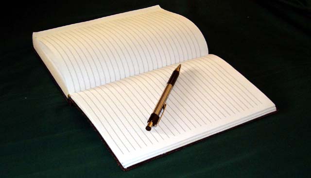
The journal is a bit blury and could have been rotated just a bit more. you were a little high in contrast ...loosing the writing on the page.
Different monitors will show this a little brighter . It is always best to turn down the over all contrast just a bit. there is a bar below the images that go's from white to black...you shoud be able to see each gradient distinctly different from the next all the way through the scale.
compostion is great! nice interpretation of the challenge.. lighting is soft and contrast with the black background and white pages is very effective.. nice job.. simple but interesting..
I like the concept and compositon. Technically, needs to be sharper, and it looks overexposed - the white paper is blown out and some detail is missing.
would it be less silent with words? cool though, i think maybe if the word "NOISE!!!" was written across the pages in red... it would be silent noise. just a thought.





 Add photograph to your favorites
 Add photographer to your favorites

 Photographer found comment helpful.


