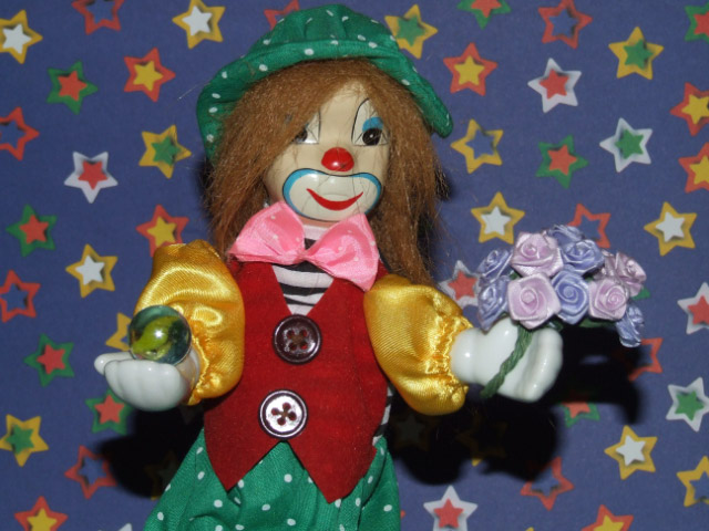
Not a bad shot, it's fairly clean and it meets the challenge. Clever, too. It doesn't pop for me, though.
I really like the backround, I'm a huge fan of stars!
Also, I think maybe next time, don't use flash. I think it kept you from doing much with this shot because a lot of editing would have blasted the lower button.
Background is very "Busy" and the Shadows feel distracting. Imagine the same subject with a solid black, red or green background and no shadows. (Back and/or side lighting.) Notice how the bottom button is washed out because of the light source. Just a thought.
I think images of statuettes don't appeal generally. The lighting is too harsh. Perhaps if you wanted to use this prop you may have placed it less predictably and perphaps done a strong B&W conversion to change the viewers perspective of it.
Idea and props are cute; lighting is harsh. The shadow looks too menacing for the mood of everything else in the shot, so I'd recommend a bounce flash or diffuser and/or fill light from the side to get rid of the shadow.





 Add photograph to your favorites
 Add photographer to your favorites


 Photographer found comment helpful.


