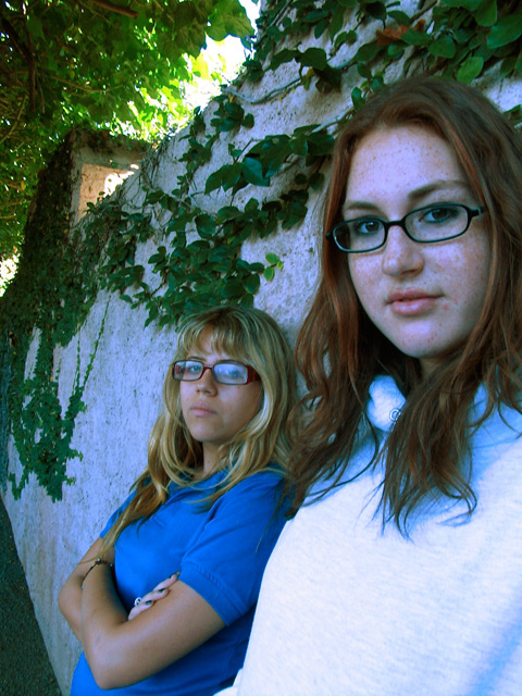
Good angle and use of a vanishing point with the wall. Basic editing wouldn't let you soften the bright spots in the sky at upper left, which is really the only distraction I see here. Nice focus on the foreground/first model.
I like this more the longer I look at it. I like the perspective of the wall and the way it is echoed by the heights of the models. I really like the colors. The front model's shirt seems to be overexposed some.
This isn't a bad shot but the white balance seems to be off. There's a pretty serious blue case to your subjects. Since the sunlit tree branches, above the wall, look fine, I'm guessing that you had your WB set to day light when your subjects are in shadow - causing a blue cast.
A double portrait :) The image would be better if the foreground girl's pullover was not so overexposed and if there wasn't so much glare in the other girl's spectacles. The image also appears a bit tilted or distorted to me.
I like you use of perspective. Next time maybe we can get the camera settings so that it doesn't mess up the coloring. Good job though and good choice of models.






 Add photograph to your favorites
 Add photographer to your favorites


 Photographer found comment helpful.


