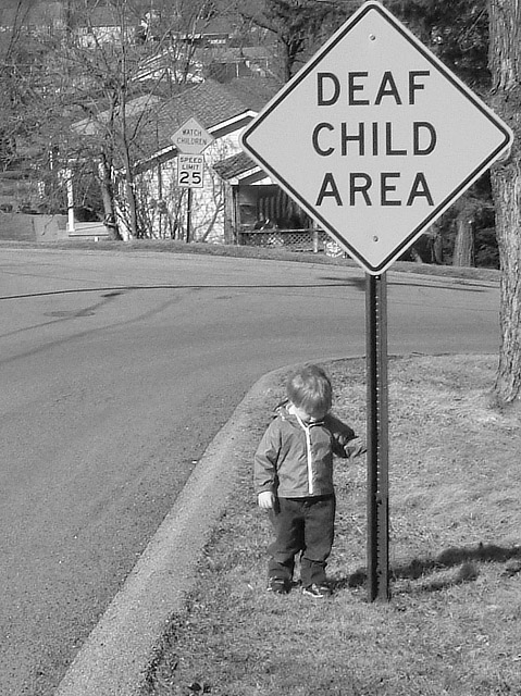
Took me 5 days to find the sign, asking about, driving around. That is my son, and he hears well, listens most of the time too. Given more leeway on editing, I would blur the background, clone out the speed limit sign, perhaps add some spot color (his jacket is light green). The sign had another sign on top of it, so i cropped to eliminate it and then had to crop the right side to match / balance things.
This could have been sharper with more contrast on the technical side. On the composition side, this is one of the most meaningful photos in the competition that I have seen so far. At that age, kids are unaware of the dangers of traffic, and deaf kids more so than usual. I drive by signs like that all the time when in the US and never really see them. Time to be a little more careful I think.
Good idea. Wish the child was either looking toward camera or 3/4 pose looking off in thought. Lots of distracting elements in background. Shallow DOF would have helped to focus attention back to the subject of the shot, the boy and sign. Keep nearby tree on right out of frame, competes with vertical line of sign. A lower angle (child's height) might have worked well here, too. Liked your choice of B&W here, try and edit for greater contrast and impact. Keep it up! :)
Poignant. Good take on the challenge, I think a little more contrast on the boy in relation to the background might give a little more impact, but that's pretty minor. 10 You get my vote for best of competition.
Nice idea - I've never seen a sign like that. I don't quite understand what denotes a Deaf Child Area - is the sign put up wherever there is one local deaf child? The sign is too close to edge of frame but otherwise I like the image.





 Add photograph to your favorites
 Add photographer to your favorites


 Photographer found comment helpful.


