No specific lighting arrangement other than being close to a window on a sunny day.
No editing as well - I don't know how yet!
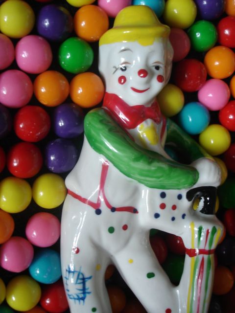
I really wanted to have an entry and my grandma's clown figure popped into my head when I saw the theme for this challenge. Grabbed some gumballs that I happened to have laying around, and then played around for a couple of days with different ideas as to how to use the two together.
Statistics
Place: 49 out of 52 Avg (all users): 4.0437 Avg (commenters): 4.3529 Avg (participants): 3.9630 Avg (non-participants): 4.0501 Views since voting: 1375 Views during voting: 536 Votes: 366 Comments: 19 Favorites: 0
Thanks for the comments everyone. Yes, it is quite blurry. I'm glad I submitted this though. I'm just starting to learn about photography, and it's great to hear all the comments and criticism, very eye opening. In a sea of about 100 clown pictures that I tried to take, I actually couldn't see that this was blurry. After looking at the other pictures on DP, it was quite apparent right away what was wrong with the picture. I guess my first goal should be to learn about focus.
I have no idea about lighting as well. I couldn't even tell you one thing about the subject. So I think that would be a good subject to read up on also.
BeeCee - thank you for your suggestion, I would never have seen it. But I completely agree with you, this would have been much better if the gumballs took up most of the space to the right of the clown. As soon as I read that, the light went on for me.
Tammer - Crazy, but I didn't even notice the circles on the clowns outfit and how that could go together with the gumballs. Again, as soon I read that the light went on. Very important lesson for me, to pay attention to small details that can really enhance a picture.
Thank you for all of the other comments. I will start reading up on "bounce flashes", "diffusers", "fill light", and "levels work", whatever all that stuff may be! :)
I like your gumball background and how it compliments the circles on the clown figurine. For me, it's the lighting and lack of focus that keeps this from getting a higher score.
A fun, whimsical concept :)
I think it would have been compositionally stronger if the extra gumball-space had been to our right (the direction his body is facing). It's a little soft (do you sharpen after resizing to dpc-size) and, IMO, could use a bit more contrast to make the colours really pop, but I still like it!
Nice colors and interesting idea. Reflections are somewhat harsh; a bounce flash or diffuser or fill light from another direction might help with that.






 Add photograph to your favorites
 Add photographer to your favorites


 Photographer found comment helpful.


