Interesting... I guess you're getting some harsh comments for this photo. Personally, I don't have anything against this kind of photography, but this one in particular does nothing for me.
There's a Canadian movie called GINGER SNAPS, in the beginning they showed some incredible shots of the two main characters posing "dead". The photos were kind of disturbing, but well-executed. The composiiton was outstanding, same with the colors. Sure, there's nothing pretty about guts and blood, but technically, the photos were perfect.
Good Luck.
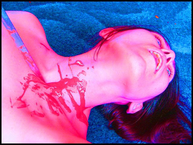
This is a very graphic photo which I don't want to look at which means it is very effective. Silence was well captured - the expression on the face really adds a lot to the mood of this photo. A different colouring might work better; something dark that will complement the gorriness (sp?) of the mood. 8
Ok, gruesome. Because of the altered color it doesn't look like a Basic Editing submission, although I'm sure it qualifies. I don't mind this photo's gruesomeness, but the neck injury could stand to look more realistic and the blood looks like finger paint to me.
Eh...I don't really like the gore of this photo. The blood looks extremely fake and quite gratuitous. Perhaps a more elegant presentation would make for a better photo.
Hmm... first off, the colors in this picture do not appeal to me, secondly the blood does not look real by a longshot. If we are to belive that she has been stabbed/cut then it would have been better see some "evidence" of that.
Composition is a bit weak, the knife left in the photo is a bit trite..it's not doing anything and not really needed since the blood and expression pretty much sum it up. The eyes open are a good touch but she looks too alive [ could be screaming]..I like the Andy Worhol over exposure. 5.
I like the color mixer effect here, although it begins to affect the hair as well. Pose/composition could be better for stronger impact (like seeing the woman's eyes better) As it stands, the blood seems to making most of the statement here, the blade almost seems like an afterthought. Certainly a morbid view of silence.
Maybe too much saturation? The pixels got a bit weird near her hair. I do understand why you did it like this. Not bad, just a bit over the top. Good entry for this challenge.






 Add photograph to your favorites
 Add photographer to your favorites

 Photographer found comment helpful.


