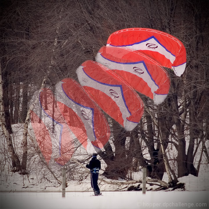
The orange chute really stands out, but i'm not finding enough else here to really grab me. If the person was also time lapsed in addition to the chute, it would look pretty cool.
Can't say that I understand what this is or why he's doing it or why it's done the way it is. I got the title after some pondering, although people don't actually have wings of their own so they in trouble if they fly. Something for the sc to try there new rules :-)
Overly complex title. Having the transparency is something others have not done and it well works here to show "age" of position and also serves to prevent the image being dominated with a lot of brights red and white.
I like the idea and execution of this image, but the kite appears to be superimposed on an unrelated scene. I can't see the connection between the skier(?) and the kite.





 Add photograph to your favorites
 Add photographer to your favorites


 Photographer found comment helpful.


