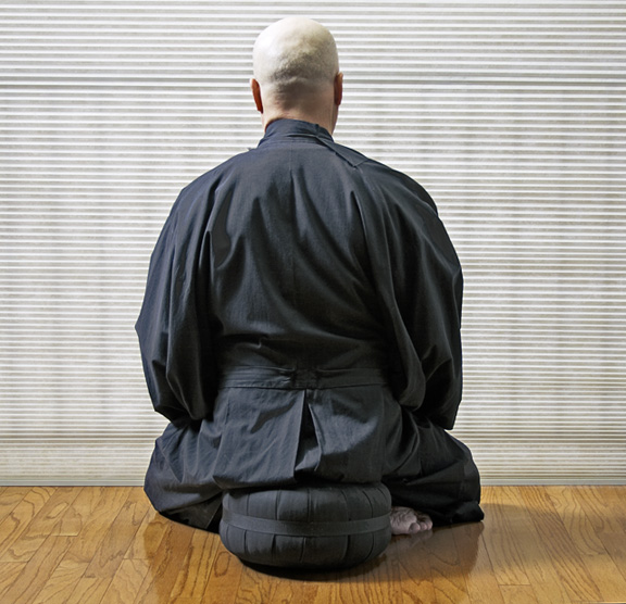
Interesting idea - model too close to top and bottom edge of frame - feels hemmed in and hence removes feeling of calm. Needs additional detail - maybe a small plant on one side - something other than the foot to give asymmetry.
I like the subject and the square crop does a nice job of renforcing the compactness of the sitter. The high lights off his head seem a bit blown out as if the backround with its varied and complex patterns and surfaces were your subject matter rather than the man. This peice almost work as a negative space study where what is in the center gives way to the surrounding area, but the balance between foreground and backround is too balanced, leaving my eye to run here and there rather than settling down to meditate on the form.
Beautiful photo. I love the consistent tone of the robe and seat, as well as the horizontal stripes of the shade contrasting with the verticle ones on the wood floor. I don't know if this would look better black and white, but it's one of my favorites.
I like the central pose and the back view. I found the blinds distracting (perhaps a narrower dof?) and the floor too bright. These two elements set a contemporary mood -- out of place for the figure and title.
Good idea but you could have put it up better like for example if u would have taken this pic outside with pure landscape in front I would have got alot more feeling for it.





 Add photograph to your favorites
 Add photographer to your favorites


 Photographer found comment helpful.


