Hi Cory,
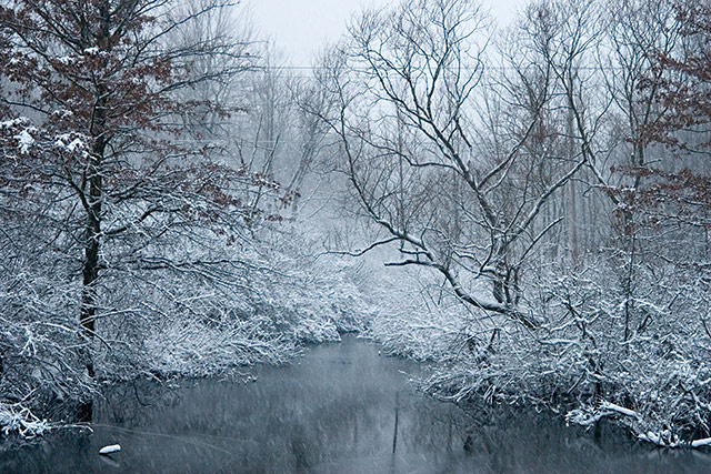
I really like the image I can grasp the sence of cold, calm & peacefulness. The fact that you went wide here is real nice using the banks as strong lines bringing us thro the image was a nice touch a little to the left or right here may have been better but it works here. As you have seen in the comments below the power lines are a slight distraction. The one other thing here is the two trees, the brown leafs just kept drawing my eye. I don't think there was enough color thro-out the image to justify a color image, B&W would have been a better choice. Overall this is a great image. Keep up the good work.
Image is a little busy and the utility lines across the image also distracting. Colors are a little too uniform, and composition is just too straightforward.







 Add photograph to your favorites
 Add photographer to your favorites

 Photographer found comment helpful.


