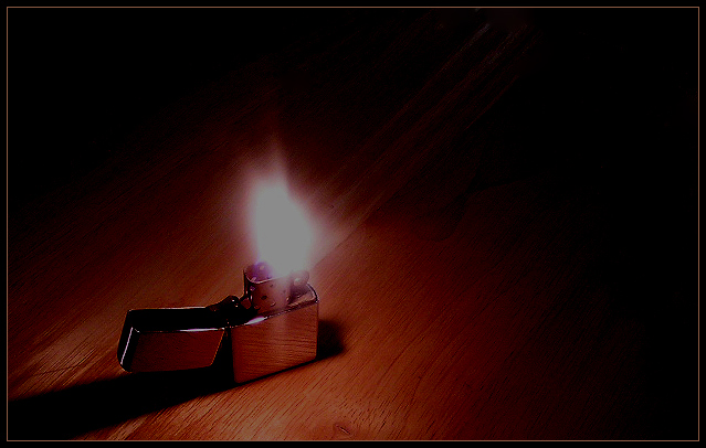
good idea but the exposure suffers from too little dynamic range. the flame is sorta gray. the lines in the wood in the center of the frame are also a distraction.
I don't know what to make of this picture. Everything appears to be so nice. The lighting, the details, the apparent clarity and even the border. But why is it so dark?
I like the lighting of the shot and the shadow it creates. The texture of the wood table is good also. What I dont like is the flame itself - it's rather large and mostly just a big white blob with no detail or shifts of color. The idea is fine, the set up is fine, the flame isnt fine.
I think a vertical crop may work better with this subject. Currently seems like too much negative space. Really like seeing the wood grain of the table. "9"






 Add photograph to your favorites
 Add photographer to your favorites


 Photographer found comment helpful.


