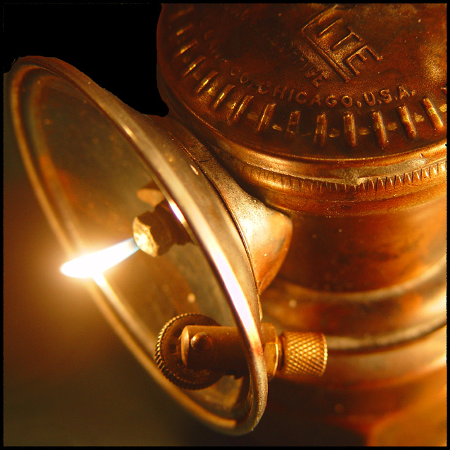
This is a carbide lantern used by miners. When water is added to the small peices of cabide in the bottom of the lantern, a flamable gas is produced.
I use this lantern to blacken the sights of my target pistol. The soot from the lantern flame is pure black. So much so, that the black paper targets look grey by comparison. The soot also keeps sun glare off of my sights.
Statistics
Place: 11 out of 113 Avg (all users): 6.2649 Avg (commenters): 7.4737 Avg (participants): 5.9762 Avg (non-participants): 6.5050 Views since voting: 1486 Votes: 185 Comments: 20 Favorites: 1 (view)
I'm begining to believe there was some kind of conspiracy here. My favorite two shots of this challenge are the last two I voted on. This shot is awesome! Love the simple color scheme and your use of the shallower DOF. You also made good use of a secondary light source (but IMHO it's just a touch too highlited on the right) to help bring out the textures and lighten up the shot. Your crop is dead on (would love to see the out of camera shot to compare)!
Kudos
TC
I decided I liked this more the second time I looked, so I need to adjust the score a little. The flame is overexposed, but the detail on the lamp and the color there makes up for a relatively small exposure error. Sorry for the first score.
I like the warm glow, bringing out the structure of the lamp, good use of DOF as well. The longer I look the more I like it .... but have to move on to the next now.
Beautiful, moody shot. I will have to remember to show this to my husband - he's a big antique fan and I know he'll like this. I love the square composition and use of the full frame - the only nit-pick I'd have is the slightly blown out spot on the rim. It doesn't bother me that the flame is a bit burned out because, well, it's a flame and it's very small and it definitely gives you the feeling of the light and heat, but that tiny portion of the rim distracts me a bit.
Very interesting subject matter, but unfortunately your attempt at removing the background in the upper left hand corner is very obvious and I think it ends up detracting from the picture. My other suggestion (since the theme of this challenge was "Fire") would be to focus on the region where the flame is instead of on the igniter.





 Add photograph to your favorites
 Add photographer to your favorites


 Photographer found comment helpful.


