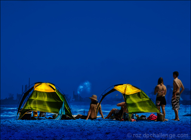
i feel i got marked down on this one because ppl assume a 'subject' has to be one thing .. i disagree .. a subject can be made up of several things .. ie the group on the beach ..
the isolation/separation is thru the colour contrast and the difference between the carefree beach lifestyle and the factories delivering noxious gases into our environment ..
Statistics
Place: 34 out of 188 Avg (all users): 6.2418 Avg (commenters): 7.2000 Avg (participants): 5.9688 Avg (non-participants): 6.4382 Views since voting: 2064 Views during voting: 313 Votes: 153 Comments: 25 Favorites: 5 (view)
Classic case of the challenge title and challenge description being ever so slightly in disagreement; one says "object" the other says "subject". "Object" implies something very singular and discrete, and the challenge title is always the most visible. I agree with you though -- your "subject" is the group on the beach.
The unnatrual blue color here really gives the photo its impact. It's beautifully ominous, if that's possible, and I think that's what draws the viewer into it. Closer investigation reveals something far more foreboding and less pretty. So an expert job carrying your message from composition through to post-processing.
I got it without reading your narrative. Again, it's another one of your fascinating photos - from your play with color, to sneaking in the factory in the background. Just keep doing what you are doing because your style is amazing!
Oh, I agree 100% Roz! This is way underrated for the WRONG reasons. And its one thing I truly hate about how people vote on dpChallenge. It slaps down people for having any creativity and soul that meanders outside a narrow contrived box! I truly hate that!!
This photo is stunning. The colors really strike me!
Great shot Roz...as ever the colours just leap of the screen and demand attention, but this is much more than simply pretty colours, it is a wonderful and thought provoking take on the challenge.
wow...looks like another planet! I like the edit, most won't perhaps...I like the statement it makes and the smokestacks in the bg...is this Australia?
like the concept. the blue does provide contrast to isolate the tents, but, for me, is just too much and it's such a peaceful colour and seems a bit out of place for the refineries. /8





 Add photograph to your favorites
 Add photographer to your favorites

 Photographer found comment helpful.


