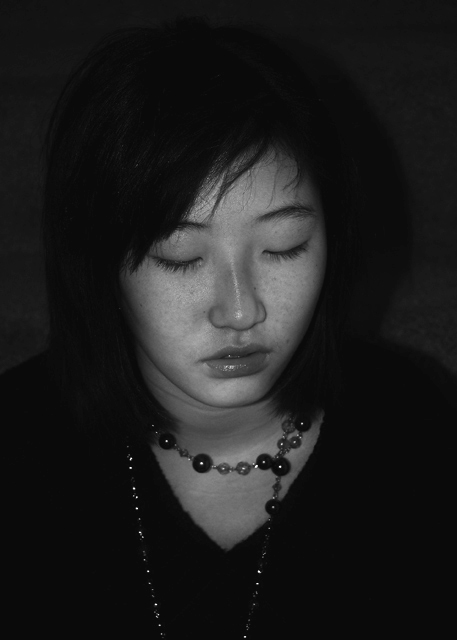
Nope, 4.3 is far too low. That said, I probably would've voted it a 5 or 6. One problem I'm sure you ran into is that on a CRT, her hair would disappear into the background, leaving her face hanging in space; in fact, I'm wondering whether that's what krnodil saw. CRTs on PCs are just darker than LCDs, even when properly calibrated.
I also agree with others it lacks contrast - I would suggest brightening her face up a bit. Not too far, but a bit. Finally you could clone out or otherwise get rid of the bright stripe on her nose.
But all of that is what I would do. Do you like it? Then just be happy. :)
Bob - I really like this, and think you were brave to go with a portrait with eyes closed. I think it might be even stronger with some area cropped from the top and right, but it sets a mood and is very interesting. Edit to add: I just saw your score and am a bit incredulous. Any photo that tells a story is worth a lot more than a 4.3!
Very interesting portrait. The girl seems troubled, shy, introspective. I don't know if she is, but that's what the image conveys to me, and that makes it interesting. I think the darkness adds to that feeling. So I disagree with the voters and commenters who don't like the contrast or exposure.
A very nice solemn moment. I think the tone contrast is excellent. Those two things combined make a terrific image. I wonder if a slightly tighter crop would have had better reaction from the voters (I'll post in the Spleen Thread of an example)
I love the expression on her face although I wish her mouth were closed, just the slight hint of teeth is a bit distracting when it's such a dark image. The lighting is lovely on her face. I'm a cropping nutter but I'd try cropping most of the top and left side which would put her face in the upper quarter, you might hate that idea, that's OK. Also just a slight curve to lift her skin tone just a touch I think would have made a difference. Feel free to pm me if I'm not making sense. She's a very beautiful girl and you have captured that well.
Well, here's my two cents. :)
The image is lacking contrast - the range of tones is low. There is only black and some dark greys here, which make the image feel dark and under-exposed. I've also had difficulty with black and white pictures like this. If I try to brighten it up any more I end up with a grainy, unpleasant photo. My only suggestion to fix this might be to try to create some better lighting. Very nice try though - I like the whole set-up you have here with the necklace and the subject's expression. Hope this was a little helpful! :)
the person in the image is very flat causing the necklace to pop, however, it still doesn't catch the eye as being dramatic. Maybe try the necklace in color or just do partial desaturation on the whole image (I'm not really sure if that's allowed, but just trying to help with an idea)







 Add photograph to your favorites
 Add photographer to your favorites

 Photographer found comment helpful.


