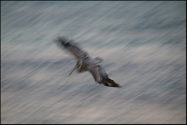
Shot this on the beach in Tulum, Mexico on Christmas Eve. I was waiting for the moon rise, when these three pelicans arrived and began diving for fish in the twilight. I had my walkaround vacation lens on the camera, which is way too slow to stop motion so I went the other way. Opened it up as wide as it would go (f/6.3) and extended the telephoto as long as it would go (250 mm, 375mm in 35mm format), then started panning and blurring the birds against the Carribean in the fading light with slow shutter speeds from about 1/10 to 1/45. Got a lot of pretty cool shots that I like a lot. This is pretty much straight from the camera, a little levels adjustment and I think I bumped the contrast and saturation just a bit, but it doesn't look too much different from the original.
Statistics
Place: 408 out of 429 Avg (all users): 4.3941 Avg (commenters): 4.8889 Avg (participants): 4.4554 Avg (non-participants): 4.2759 Views since voting: 994 Views during voting: 251 Votes: 170 Comments: 21 Favorites: 1 (view)
I dont care about the score, I still like the shot a lot. Maybe it could have done with a bit more contrast- but the blur is what gives the shot atmosphere.
The blur is terrific. Even if you would have gotten it sharp, difficult for the DPC crowd. My only suggestion would maybe to crop just a bit off the right and to increase the contrast. Even without that, the shot is stunning and considering the conditions even more rewarding.
Love this one - I think the blur is just right and the background is a beautiful watercoloury mess of greys, greens and blues. The composition doesn't bother me as such (we've both received criticisms for centered comp on this free study) but I think the direction in which the bird is moving somewhat negates the space behind it (if that makes sense) so for a greater interaction with the negative space it would help if the bird were towards the top right. Well done for such a brave entry, which you can see has not gone unappreciated!
Whoopsie, I was one of your low voters, I gave this a 3. When the blur side challenge was going on I met up with Jeffery Levy in Washington, DC when I was on vacation. He was taking part in the side challenge so we talked about it. I told him I hated blur and did not see the reason behind it 99% of the time. That goes for this photo, sorry.
I thought this was a cool effort. It has a distinct watercolor feel and I think you pulled it off pretty darn well. I probably would have given this a 5 - and here is why....
I think the crop and placing the bird dead center was one thing that I would have done differently - the current crop seems a bit too static - and this contrasts with what you are trying to bring to the viewer. If you were going with the square crop, a tighter one may have worked well to reinforce the motion. Otherwise, placing the bird in more the upper right quadrant to provide some neg space for the bird to fly into and to show the textures of the sea below could have been cool. I think one thing that hurts the image is the low contrast - I am a contrast freak, but I think a bit more separation of the bird from the background may have worked better.
I like this a lot, Dennis. The only thing I would have done different is the crop. Maybe if the bird was a little farther up in the right side. It really would make a beautiful print.
Melethia summed this shot up extremely well, and there is not much I can add to what she said. I personally like blur that is intentionally done, as it was here. I gave this shot a 9.
Blur shots, in general, are not well appreciated here except by folks who really like them and do them on purpose. I like this. I'm one of those folks. So to get a better score at DPC, don't blur! But if you are gonna blur, let your own taste guide you as to what you like and don't like. My one nit with this would be the centered comp. Sometimes it works, sometimes not so much. I can't say for sure with this, but it might be worth playing with a bit to see if there's a crop or composition that makes it a bit less static (which is hard to say about a motion captured shot). Oh, and I'd have him bombing out of the shot, which is another DPC no-no. And since I'm a monochrome gal at heart, this is very nearly there but not quite. You could try saturation to bring out the color, or go all the way to B&W with it. I'm glad you chose to enter this.
I actually like this a lot ..... I not completely sold on the crop but I'd like to play around with it a bit.....this looks like a series in a fine art show to me......I'm actually sorta surprised how much I like this.....I'm not usually drawn to images like this.........
A good effort to save a blurry shot, but the effect seems to fall a little short for me. To be fair, these thing dive-bomb fast, and it's certainly tough to catch them stop motion.







 Add photograph to your favorites
 Add photographer to your favorites

 Photographer found comment helpful.


