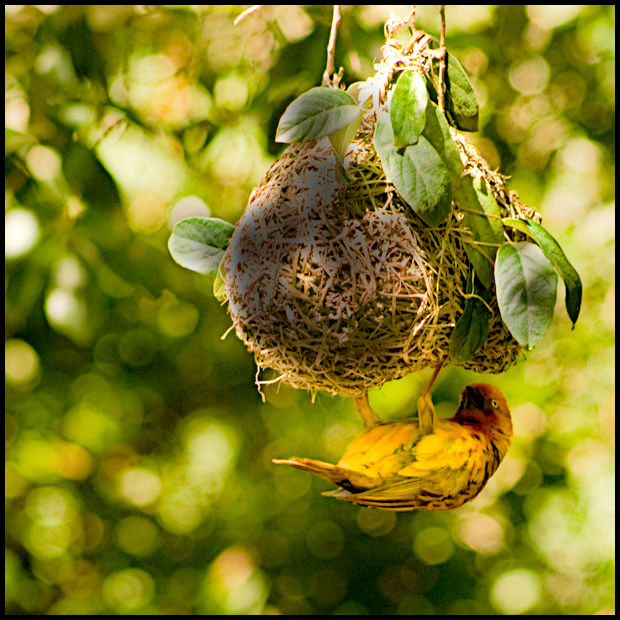
I think the movement is wonderful. I will agree with Deb below, if you cut off the top I think it will make for a much better shot. The reason is you get the highlights out of the top. The highlight on the bottom are terrific especially since they mimic the bird's shape. I gave you a five in the challenge, so a bit better than your score, but it would socre a 6 or 7 I think if the top might have been cropped out. Good find nonetheless.
The mottled light is difficult to work with. Love your bokeh and the colors. I fiddled with it a bit with a levels adjustment layer, which made the colors more defined so the bird stands out more against the background. Some sharpening also helped the bird pop better. I probably would have given it a 5 if I had voted.
I thought it was my perfect. Thus my 10. But I'm weird. I don't want a clear subject. I want to look at the whole photo or else I don't feel I'm getting my money's worth.
that background is truly lovely - bokeh at its best. the composition is very good, i really like the placement of the nest in the frame. the image looks simply wonderful from a few feet back, but at the desk a few problems creep in.
i also agree with deb about the blending in. perhaps if you greened up the background a bit, that might help the weaver stand out a bit more. another point is the focus isn't quite on, but looks like it's trying to be. does that make any sense? it's just so close, but not quite there, which becomes a bit distracting. and, lastly, the shadow on the nest looks a bit grubby, like that section is exposed differently. did you burn the shadow in a bit?
I was thinking that if the nest was sharper or perhaps brighter it would help the photo. that nest just sucks my eyes into it. I think the bird is captured very well but the nest distracts from the bird.just a thought I like the background. I was also thinking perhaps a little higher Iso and a faster shutter speed would of helped you.that bird had to be moving a little bit with the nest. then again I also like the picture the way it is as it has started to grow on me the more I look at at. Do you have any other edits of that picture you could post? "
I completely agree with Melethia! There is poor contrast between the subject and the rest of the background. In this case the background is too busy, so maybe a selective desaturation would have helped.
The problem with wildlife is they're designed to blend in, silly things! Don't they know how hard that makes it for us to get their pictures? It would be hard given the light and the setting here to truly make that little guy stand out, unless you did something freaky like desaturate everything except the bird, and that quite often just looks silly.
You got some good comments during the challenge that explain why people voted the way they did - and that's a good thing. I'm curious as to why you only marked some as "helpful", though. While they may not see the shot the same way you do, at least they've offered some reasons as to why.
One thing you might try is cropping the top off even though it cuts off the support of the nest ball. By cropping and making it a landscape oriented image, it brings the bird into play a bit more as far as where the eye goes in the shot. Try it and see what you think.





 Add photograph to your favorites
 Add photographer to your favorites

 Photographer found comment helpful.


