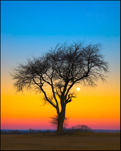
Bumped exposure, saved as 16 bit TIFF, cloned out sensor dust, (I finally cleaned the damn sensor!!!), converted from RAW, used the HDR conversion tool, bumped saturation, resize, added border, saved for web, submitted.
Statistics
Place: 140 out of 429 Avg (all users): 5.8634 Avg (commenters): 5.6250 Avg (participants): 5.8302 Avg (non-participants): 5.9273 Views since voting: 1264 Views during voting: 268 Votes: 161 Comments: 26 Favorites: 2 (view)
I gave it an 8! I think its a wonderful image. However, the sky does look a little bit strange in my monitor, specially the blue part. I use a LCD monitor and I've noticed that images that I processed on CRT monitors and looked great on them looked weird and full of artifacts and blotches on the LCD.
Hope this helps. Regards,
Ok to be honest, this image does nothing for me. But I'm sure that has more to do with my personal taste than anything else. The rainbow sky effect isn't to my liking and I don't like how the tree is kind of a silhouette, but not really. I'd like it to either be one, or not. But hey, your image scored waaaay better than mine so that should tell you how much of my opinion you should value. ;-)
It's an iconic image of commercial value. But you need to get that artifact-ing under control in the sky. Even at this diminutive size, I can clearly see it and it detracts from the image. Perhaps try running Noise Ninja on the blue and red channels - experiment and make sure that the procedure does not cause posterizing.
I really like the layers created by the different hues in the sky. The placement of the tree works pretty well. I gave this a 6 during voting, primarily due to the significant color noise I see in the sky - as if the blues and cyans are not balanced when you modified them in Hue/Sat. A bit of smoothing either with a brush or using a noise reduction approach would have likely helped a great deal and bumped that score well over 6.
I always liked those kind of pictures, so I'm a little bias here. This shoud have finish well into the 6's. The colors are just great. Have you tried cropping out most of the field at the bottom? It would be interesting to see the result.
I think that maybe the saturation is a bit intense - though I can't say for sure without seeing the original. It just feels a bit intense. It's very colorful this way but as one commenter remarked, it almost seems unreal because there's no gradation - just distinct bands of color in the sky. The composition is good, but just a tad static. Since I don't know what's to the right, my suggestion of maybe having the tree to the left and open up some space on the right may not be do-able. The way the tree is formed, the location of the moon, and the small circular clump of trees in the distance just seems to beg a bit more open space on the right for balance.
For me, the color bands of the sunrise are so even it almost looks fake in a way. My favorite part of your photo is the upper half with the tree and the moon.







 Add photograph to your favorites
 Add photographer to your favorites

 Photographer found comment helpful.


