Greetings from the Critique Club -
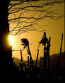
My first reaction to this image is "Cool colors". Nice job of catching complimentary colors between the sky and building. The general comp is somewhat pleasing though I think I would prefer to see an even wilder angle on the building.
What I think this image suffers from most is oversharpening. Where the building should be sharp its a bit much. And way overdone on the sky. I think if you had left the sky alone when it came time to sharpen and maybe even gone heavy on Neat Image or something you woudl have had an even better contrast - smooth and sharp. As it is though its just too grainy.
I think 5.3 may be a little low overall as it meets the challenge, but I wouldnt have expected it to score a whole lot higher than say a 5.6.
Hope some of this may help.
Tim |






![The Penthouse [Fisheye View]](https://images.dpchallenge.com/images_challenge/0-999/792/1200/Copyrighted_Image_Reuse_Prohibited_626992.jpg)
 Add photograph to your favorites
 Add photographer to your favorites

 Photographer found comment helpful.


