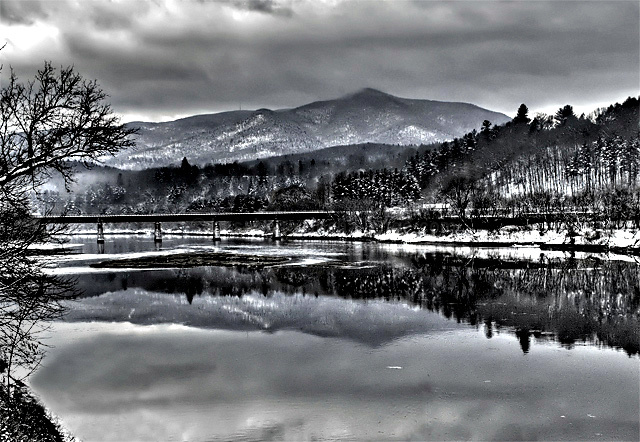
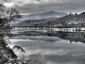
An overcast morning after the Christmas Snow. My wife and kids were out skiing and I drove around looking for some shots. I had a pretty good morning, probably with about 5 to 10 keepers - maybe calendar quality shots. This shot is one of my favorites of Mount Ascutney that I have taken so far. The water was so still, the clouds were rolling over the mountain, and the fresh snow provided just enough contrast to the starkness of winter in Vermont.
Tonemapped of a single RAW image using Photomatix Pro.
Cropped image
Cloned out reeds and grasses in foreground and replaced with reflections of clouds (used the incidental powerline rule)
Noise Ninja to smooth and sharpen
Adjusted levels
Hue/Saturation - partially desaturated.
USM at large radius.
Save for web, burned and dodged, USM at small radius and saved.
hope for about a 6...a pretty scene, albeit quiet for a free study and will likely get overlooked.
Post Challenge for comment group I really liked the photo but I have some agreement with the commenters that say it is a bit too contrasty and overprocessed. I guess what I am looking for is how might I have done this one differently. I want to print this one and slap it on a wall and am looking for some opinions. Here is the original HDR of the image and also an alternative edit (one that I think hits on what some would have rather seen). The third one is without HDR processing.
Statistics
Place: 174 out of 429 Avg (all users): 5.7102 Avg (commenters): 5.4615 Avg (participants): 5.5526 Avg (non-participants): 6.0000 Views since voting: 972 Views during voting: 279 Votes: 176 Comments: 29 Favorites: 1 (view)
5.71? Your having a laugh, in a free study when there were so many great landscapes I thought that this beat the vast majority of them into a cocked hat
Brilliant reflection and I love the cloud touching the top of the mountain
Just to prove that you can never please all the people all the time I thought the high contrast really gave the shot some bite and feel it would have lost something without it
A 4 from me... I don't want to notice the HDR effect and this one screams HDR. I quite like the unprocessed one, a bit of +saturation & curves is all I woulda done with it. Most of the time for me, less is more. I don't even go into Photoshop much these days, I just use my Nikon Capture Editor and I'm done.
I gave this a 6 for the scene but you would have gotten more if it hadn't been overprocessed. It looks a bit noisy in the sky and I can see haloing around the tree on the left.
I remember this shot, and remember thinking, wow, great image, too bad its so overprocessed. For me the harsh high contrast processing doesn't complement the scene. Looking at it a bit closer, I like the way the processing affects the distant mountains and sky (and their reflections), but the bridge, framing trees and opposite bank are all too high contrast for me.
Scanning the comments below I see I'm not alone in this view. But as Deb said it comes down to a matter of taste, so if you love it that's all that matters.
Peter, this is a great b/w conversion and a beautiful scene. I admit I prefer the second outtake (squarish one) as I think the softer colors suit the mood of the day better - the entry looks just a tad oversharpened to me. Lovely as usual though!
I like this. I like the way you processed it. I like the way the black trees stand out in the new snow. It does look so peaceful. I imagine the color version is quite nice too.
I rather like this shot. I read the comments and while I can see the points being made, overall this is a gorgeous shot. I think it would have scored better if the processing was toned down just a bit. I also wish I could compare it to the color version.
Melethia summed this image up for me nicely. The processing isnt to my tastes in this image. A lighter, softer possibly colorful version may have done you better.
The processing, as you can tell by the comments, is a matter of taste. Some really like it, some not so much. My first impression was it was too much contrast for this scene. The stillness suggests something softer to me. The composition is very strong - I like the split horizon - but again, it's a matter of taste. Some may prefer a more "rule of thirds" comp with respect to the horizon. The basic shot is excellent. I think it would be interesting to see other edits of this shot.
The darkness to me is intrigueing and a little distracting all at the same time. I think to go with the title you chose I might've softened the color up just a little? Just my 2 cents though.






 Add photograph to your favorites
 Add photographer to your favorites


 Photographer found comment helpful.


