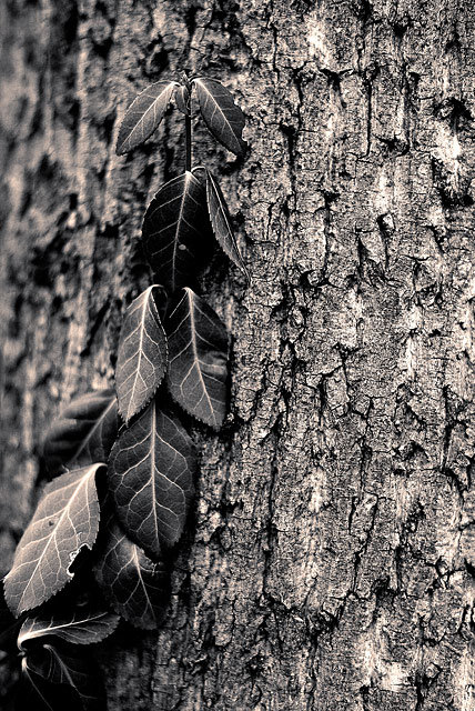
A study in textures, before the Textures challenge started. Thus the black and white treatment - color just was too distracting.
I came across this vine wrapped around a tree, the very top of which held itself fast against the bark as if nailed there, which seemed to my eyes to be defying gravity.
If I had to do it over again, I think I might have made the DOF a bit less shallow, catch a bit more detail in the background bark on the left. But then again, maybe not - too much detail on the left might have resulted in obscuring the vine too much. Ah, it is what it is, and I like it. :)
Statistics
Place: 317 out of 429 Avg (all users): 5.1718 Avg (commenters): 5.1667 Avg (participants): 5.0962 Avg (non-participants): 5.3051 Views since voting: 780 Views during voting: 238 Votes: 163 Comments: 12 Favorites: 0
Very nice and that's a perfect title. I like how with the tones you chose, it almost looks bronzed. I'm digging the dof. I do think colorcarnival makes an interesting point - makes me wonder how this would look if the leaves were in color, keeping the bark the way it is. In any case, well-seen!
Ooooh pretty. I love the color tones and textures. I think with something like this, you have to decide what the focal point is going to be. As is, the viewer has to decide between the bark and the vine. This looks like a photo that would be fun to edit!






 Add photograph to your favorites
 Add photographer to your favorites

 Photographer found comment helpful.


