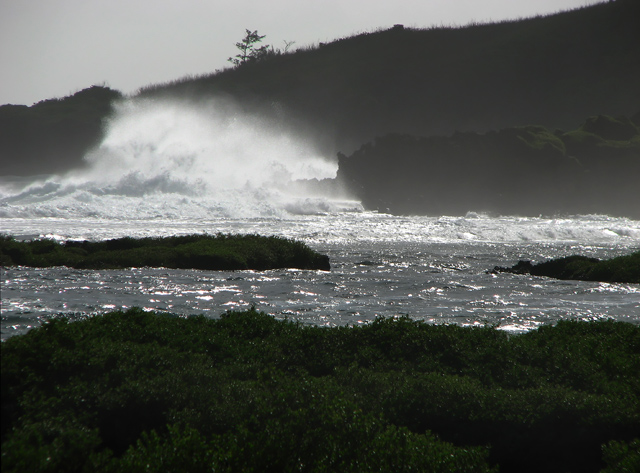
The magnificense of this shot is located in the upper left quadrant, the rest of the image doesn't add anything to it. A crop concentrating on the breaking waves would have scored better IMHO.
I agree. The composition isn't strong here. I do like that the break of the waves is in a good spot as far as rule of thirds are concern. However, you have too many horizontal lines that break up the flow so to speak. The lack of color doesn't help either. I think if you are going to convert to b/w or desaturate, the composition and or the light has to be really good to compensate for the lack of color.
That all said, if you had some other element in the shot that gave the wave scale or there was some other interesting juxtaposition, the faults in the photo may actually turn into assets or at the very least become irrelevant.
I think this would have scored about a point higher had you really doctored it up for DPC. I don't necessarily agree with all the doctoring, but it's what scores, and apparently what appeals to most people. More detail in the foreground, or perhaps a crop focusing on the wave and complete lack of detail in all but the water - something high contrast?
I like the horizontal lines also but would lighten the darker areas slightly in Photoshop. I have Elements and the shadows have a lot of detail that I can see could easily be defined.
The magnificense of this shot is located in the upper left quadrant, the rest of the image doesn't add anything to it. A crop concentrating on the breaking waves would have scored better IMHO.
This needed a few highlights in the dark background areas and it would've scored a bit higher. Also, I'm not sure the foreground is necessary. A different crop that accentuated the splash might have been more dramatic.
I like the forms you went with. The different lines are nice. The reflections are a bit bright, I think in this case a polarize mihgt have helped. That is a spectacular wave you managed to capture.






 Add photograph to your favorites
 Add photographer to your favorites

 Photographer found comment helpful.


