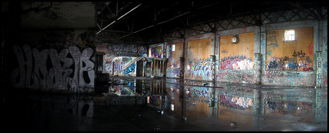
One of my favorites for the challenge, really does meet the hidden city theme as well as any in the challenge. I noticed a lot of the comments did not like the darker left side but I kinda like the hidden detail, not sure I would change anything except maybe level it out a bit. Under rated in the voting in my opinion.
This just screams to be bigger. I will be so glad when the size we can enter increases. I would love to look at this again, in a bigger size. the details are just teasing me.
It looks like the horizon is a bit tilted. Not sure though, could be the perspective. As the pic is so horizontally stretched, I think left/right should be more balanced.
I'll bet there are some great macros to be had in here as well. Love the use of reflection, though I think the darkened left side of the picture detracts (a bit) from the absolutely stunning right side.





 Add photograph to your favorites
 Add photographer to your favorites


