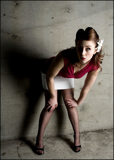
Good image although I think it would have been better with more space on the right. If that means cutting off some of the shadow on the wall then it would be ok and better for the composition. It would also be better to see a little bit more of the model's right side of the face, it's a little bit too dark. But in whole it's an interesting image and not bad as it is.
this is cute! It could use a little tiny fill light to get just a little light on her other eye though, only having half her face but all of the rest of her body is kind of awkward






 Add photograph to your favorites
 Add photographer to your favorites


 Photographer found comment helpful.


