Crop, Hue/Sat, B&W, Noise Ninja, Levels, Curves/soft light, Gradient Map (black to white), border, resize, save for web.
====================================
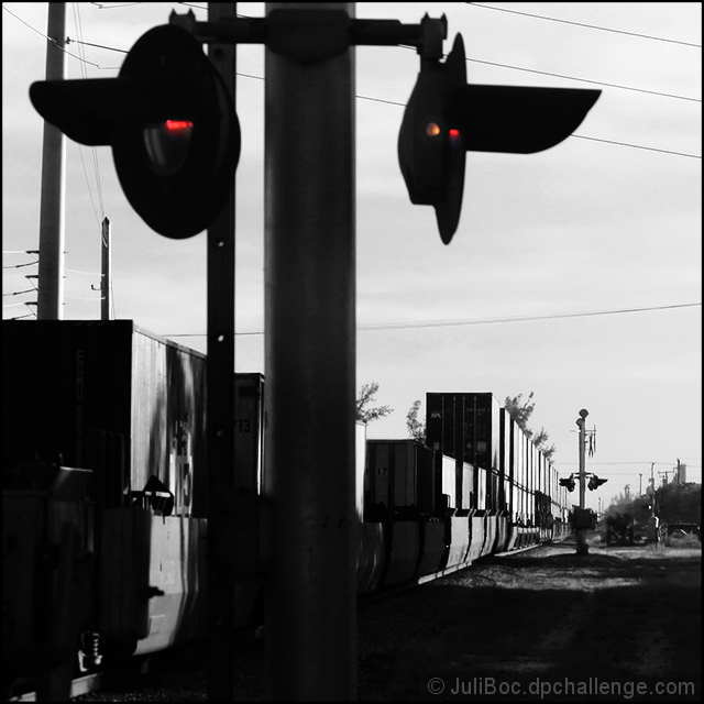
It was the crossing signals, not the train, that I intended to convey the perspective. But I think the image has too much in it (too busy?) to be effective. Too bad, because I like the composition.
Statistics
Place: 123 out of 148 Avg (all users): 5.1484 Avg (commenters): 3.6667 Avg (participants): 4.8364 Avg (non-participants): 5.3200 Views since voting: 730 Views during voting: 219 Votes: 155 Comments: 10 Favorites: 0
This was one of my higher scores int he challenge actually. I think it's a fine image. I'm not surprised it finished low, because it's not really addressing the "perspective" issue in a way people can comprehend. They will see the receding diagonal of the train as the "perspective" part, and that's not what the picture is about. But very nice PP work and an "arresting" image (pun intended).
I think it's the vertical line of the lights/signal that breaks the perspective line of the train that causes some viewer 'discomfort', particularly because it's in the central foreground. It's a lovely shot, but if I try to imagine the same shot with the lights but without half of the central pillar I think it would have been nicer. Not saying you should clone it out or mess with it, just trying to help provide an explanation as to why it might not have been as well received as you expected.
lol I love how people want you to clone out things that really are a natural part of the scene. I love the black and white conversion and this has a rich contrast. I love the perspective of not only the train but also the size comparison between the two signals. Probably should have scored a little higher than it did.






 Add photograph to your favorites
 Add photographer to your favorites

 Photographer found comment helpful.


