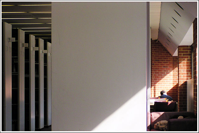
That couch reminds me of the huge cushy chairs in our library. I want to go there now and just take a nap. Bad idea with a test coming up. Looks quiet indeed.
A good idea, but I think it wasn't executed very well. The big column in the middle seems to be there for a reason, but I can't imagine why. A "No Talking" or "Quiet" sign on this would make it understandable, but a blank white column doesn't seem to have much meaning. It also would have been nice to play with the sunbeams a bit more.
bad composition - over 1/2 the pic is a blank wall. (and a noisy/grainy one at that) Unless the point of this pic is to have me look at a large blank wall.
Very creative composition. I love the solitude you've captured by having a lone figure on the right, balanced by the bookshelves on the left. Normally, the chunk of wall in the middle would be a little too weird, but the fact that the sunlight cuts across and joins it to the right side of the frame makes it all work very well together. Great work - don't be surprised or too disappointed if a lot of people here don't "get" it, though. It's very artistic and the voting public doesn't always consider the concepts of composition and art as much as they look for a "wow" factor. 9
Appears to be a shot of a blank wall, not really seeing much in the way of a library. [books, people, tables...etc] Maybe a different composition here.





 Add photograph to your favorites
 Add photographer to your favorites


 Photographer found comment helpful.


