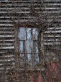
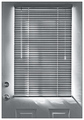
...the lighting was meant to be very subdued. I didn't want this to be a "stock" shot. If anyone is not seeing all the detail...time to seriously consider some hardware calibration implement.
Statistics
Place: 52 out of 207 Avg (all users): 5.8316 Avg (commenters): 7.3636 Avg (participants): 5.5658 Avg (non-participants): 6.0000 Views since voting: 1017 Views during voting: 283 Votes: 196 Comments: 16 Favorites: 1 (view)
As far as gray tones you have about all of them. I do wish the light was a bit brighter across the subject. Maybe just enough to hold the back out from the background. Other than that small wish, very nice. I was turning it over 90 degree's to the right and that looks cool too.
I think you found a wonderful subject for this challenge. However, the lighting needs to be a bit more dramatic (maybe a bit more from the side) and the image could use more contrast for my taste. This could be a result of your conversion method to B&W (desat only). If so, take a look in the tutorial section. There is a great tutorial on B&W conversion.
I never forget that I am mortal...this one is definitely in my Top 3 for this challenge. The lighting, detail, and composition are just perfect overall and for this challenge...IMHO.
dead and wilting. I like it. 10 Coming back to finish my post. I like this image because although it IS dieing and wilting the harsh coloring allows me to appreciate the texture on the plant.






 Add photograph to your favorites
 Add photographer to your favorites

 Photographer found comment helpful.


