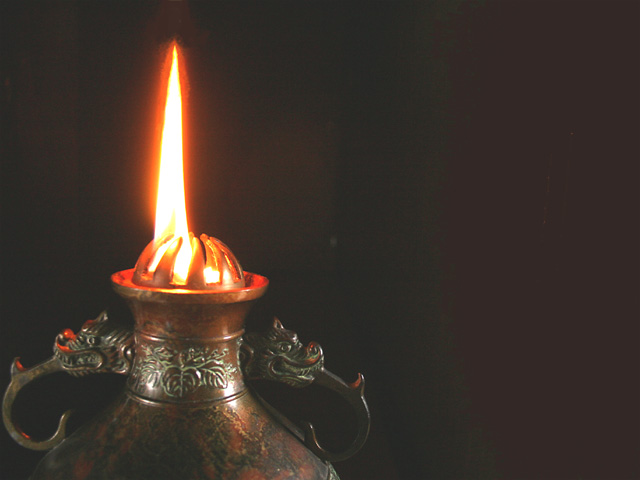
Too much color in the background, which should be black I think. There needs to be a little less red, more contrast too. Composition is too much to the right.
In my opinion this would look much better if you adjusted the levels to make the entire background black. It's a nice shot, but as it is it seems a bit washed out to me.
A vertical compositioning of the frame would help to make this shot more interesting. The negative space on the right makes your eyes wander away from the main subject. Interesting details of the dragon handle on the lamp.
Composition is good but the flame is a little overexposed. A slightly darker image would maybe have helped add some detail in the flame and also darkened the background some, which looks kinda streaky. Else you could have moved the lamp farther away from the background so it didnt show as much.






 Add photograph to your favorites
 Add photographer to your favorites


 Photographer found comment helpful.


