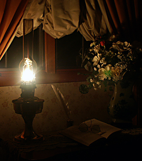
Variation on a theme I've used in the past. Revisited the same table and props I used in two other challenges.
Cropped for effect; made minor adjustments: adjusted hue; burned to small hot spots; smoothed some wrinkles; sized for the web, and unmasked by 80% for sharpness.
Statistics
Place: 45 out of 113 Avg (all users): 5.4341 Avg (commenters): 7.5000 Avg (participants): 5.1667 Avg (non-participants): 5.6957 Views since voting: 1043 Votes: 182 Comments: 13 Favorites: 1 (view)
Wow, almost the last shot of the challenge for me to vote on and I have my favorite for the theme! Love the tonality, the uncluttered yet full composition and the simplicity of the single light source. My only complaint (and it's a small one) is the light itself is a bit overexposed and causes some flare.
TC
very well composed but the lighting could be better balanced. The book is lost at the bottom, and so reduces the impact of a nicely composed triplicate subject.





 Add photograph to your favorites
 Add photographer to your favorites


 Photographer found comment helpful.


