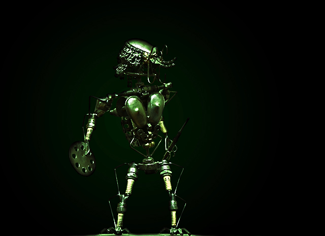
The title is the tagline from the movie, The Predator. And yes, you guessed it that is a model of the Predator made out of car engine parts.
Ok, I have never bought anything on eBay before and reallly don't get the whole eBay thing. But, I did want to enter a challenge, after a super long rest, and I prefer Advanced Editing than Basic.
I did a whole bunch of editing to this, which is really unusual since I am more of a crop and resize kinda gal. Let's see:
1. Levels;
2. dumped the white BG for a radial one;
3. dodge 'n burn to give it some depth;
4. overlay a green hue layer at about 62%;
5. reduce noise;
6. USM;
7. Resize; and
8. USM.
I think I left a step or two but those are the major steps I took to achieve this shot. Hope it does well!
Peace
Rusia
Statistics
Place: 76 out of 87 Avg (all users): 4.9438 Avg (commenters): 5.3750 Avg (participants): 4.7000 Avg (non-participants): 5.0250 Views since voting: 963 Views during voting: 352 Votes: 160 Comments: 9 Favorites: 0
My first impression when looking at this photo was that I wasn't quite sure what it was, but that it had a unique, almost "alien" type quality to it. And then I looked at your notes and saw it was the Predator :-) So I felt that that "alien" feel was very appropriate! I think the background you chose definitely helps give that feel, and it was a great choice to keep the shot simple.
My other thought was that this has a good start at really having some movie-poster qualities to it (something that typically scores well here). To get that super-great score, it just needs a little more drama. I think that some slightly different lighting would really make this shot pop and stand out in the crowd. Figures in general are pretty hard to light, and I don't have notes on your lighting, so my apologies if this advice goes awry! I like the shadowed look that you've created on the front of this figure, but it's lacking a little bit of detail that gets hidden at the edges. One way to solve that might be to add some soft backlighting, which would help highlight the edges--making it more obvious what the figure is. I think, particularly in this case, that it would also help the viewer see this cool piece of art made of car parts!!
I think that a bit more total light might improve the score a bit too. In general, regardless of how fitting to the theme of the shot, darker images are harder to win with. There are tons of reasons, but the biggest one is that it's hard to really see the shot...which means the average voter won't look at it as long as they should. Because focus, detail, composition, and all of that are some of the criteria we vote on, it's hard to score well with a photo where the lighting hides some of those technical aspects.
I hope that helps a little, and if you ever do a reshoot or want a sounding board, feel free to send me a PM!
Interesting lighting and works well because of the black backdrop - any small distracting background elements would have ruined this. If only the figure was position more to the left
Somewhat indistinct to me. Possibly the result of having to scale down to 640 pixels. It appears to be a sculpture made from spark plugs and other parts?
A little dark and high contrast. This thing would be hard to light. Maybe a lighter background would help define the outline better. I would also offset it to the left a little to off-centre the composition.
1. I have absolutely no idea what this is.
2. The light is really really harsh, which contributes to problem #1.
3. The colors are just not very appealing. This is a big deal with most DPC voters. Do a search on the forums, there are certain colors that usually ribbon.
4. The photo is not very sharp. This could be due to editing or due to a poor lens. If it's a poor lens I feel for you. My Canon A85 had one of the worst lenses ever, and unfortunately, this matters on a site like DPC.
I gave this a 3, so that's why I left the comments, hope they help for next time.





 Add photograph to your favorites
 Add photographer to your favorites


 Photographer found comment helpful.


