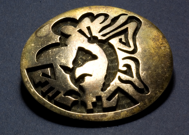
This pin was made by a Hopi silversmith. I'm ashamed of myself for letting such a treasure get so tarnished. But since it did, I thought it seemed to suit this challenge.
Statistics
Place: 168 out of 207 Avg (all users): 4.8677 Avg (commenters): 4.0000 Avg (participants): 4.7606 Avg (non-participants): 4.9322 Views since voting: 908 Views during voting: 245 Votes: 189 Comments: 9 Favorites: 0
Shannon,
As the rest have mentioned quite accurately , the lighting can be improved further. You top lighted the image and caused
very harsh shadows. Try to diffuse your lighting. If you used flash , use a diffuser (if you don't have one just cover the flash head with
tissue paper - use 1pc. to start with).
The pin is perhaps too ordinary (I think the key to this challenge was to take something at the exciting end of ordinary). But apart from that, there are some things you could have done to make it more interesting:
a) more interesting background (eg. place is on a wool sweater which has a pronounced texture, or on a blanket that looks like it could be of Hopi origin; or place it at an angle on a mirror so you can see both top and bottom of the pin)
b) change the composition so that it is not right in the middle (consider the rule of thirds, for example)
c) add other items to the image that either complement or contrast with the pin
I also agree with the previous comments about glare/lighting
Okay.....this image is clean and decent, but it doesn't really grab you and make you want anything from it like more of a description, or the pin itself; the back ground is a little flat, and it's just kind of too ordinary. Maybe had it been brighter, or on a brighter background.....
Nice detail and tone. It would make a fine illustration to show it in a book or on Ebay. I just don't find much to hold my interest in the view of it. A little too plain a view of an interesting item.






 Add photograph to your favorites
 Add photographer to your favorites

 Photographer found comment helpful.


