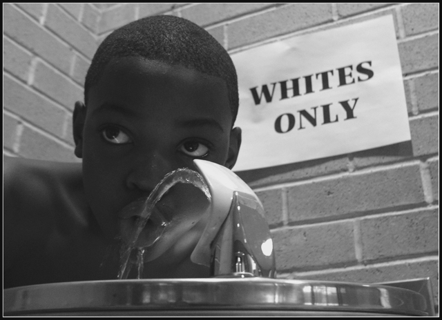
This is one of the best representations of racism in an image I ever saw. I seen it before, but I don't know why I didn't put it in my favorites, maybe I whas in hurry. I am here to correct that now.
What a moving and very emotional photo. I'm so happy you posted it. Living in the south I can really relate to this child. There's NO reason for discrimination of ANY kind ! Thank you...this photo is fav'd in my list.
Thanks so much everyone! I had lots of fun dreaming this shot up & actually taking it. My model, Devin, was so great! He did exactly what I asked for without complaining or anything. Much love & thanks to him!
Originally I wanted the sign to be more authentic & I had a painted sign all ready but I couldn't hang it off the wall. Hence the quickie printer job that hurt the shot a bit.
I'm still really taken aback by all the comments & that I actually won a ribbon! Who would of thought!
I think I have been having more fun with my shots lately & am finding creative ways of expressing myself more. Very happy that not only do I think I'm getting better but that it is being affirmed here on this site that I love so much!
This shot was taken in the Crotona part of the Bronx in The Mary Mitchell Family & Youth Center on Mapes Avenue.
Congrats on the ribbon. I didn't get to vote on all the images because of computer problems. Excellent angle. The expression on his face is perfect. It really gives you a sense of him on the lookout and taking a quick drink. This is a very powerful image.
September 1st, 1955, the freedom movement came alive/ because of Sister Rose, you know/ We don't ride at the back of the bus no more....
- the Neville Brothers
I like the setup of this. The fear/apprehension in his eyes really makes the shot. very nice.
Did you print off the sign and then put it up? looks like normal paper. 8
One of my top four from this challenge. Easily the most powerful, realistic depiction of classic conflict out of all 200+ photos. Well composed, very dramatic and full of feeling. Photographically, I wish the whole image was perhaps exposed another 1/3 of a stop to bring out more detial in the boy's face, but that's very minor in this powerful image. Well done!
Good concept. And bravo to the spirit represented by the young man! I think the image could use more contrast--it would make it more "in your face." The low contrast keeps it at a distance. Overall--well done!
Very emotional; there is a lot to like and admire in this shot. For me, the tones are too similar; I'd like to see more contrast. But I like this very much.
Fantastic! When I first looked at his picture, i thought: "Hey, it´s a little bit under-exposed". But, after that, I realized that it is probably intentional - the under-exposition in the kid made the kid´s skin darker, and enhanced the "whites only" conflict. I hope this one gets the blue ribbon, it´s the best of all.
I'm not sure how to think or feel about this. Is that good or bad?
It will be interesting to see what you were going for. Racially motivated statements are tough for folks to stomach.
Photographically. -- The foreground is strong, but the sign taped to the wall should be in focus as well. The DOF should be deep for this statement. This is a powerful statement, but no one that many are comfortable addressing. Good luck -- High marks.
Great setup--the childs sideways glace really makes the photo for me. It really looks like he's keeping an watch out for someone coming. If he had just been looking down into the fountain, it wouldn't have been nearly as powerful. Nicely done. 8
Greetings and kudos on an excellent photograph. I really love the way this young man's eyes are turned looking out of the frame. I assume he's watching for someone to scold him for drinking from the fountain. I think you have captured the essence of 'conflict'. Congrats on a beautiful photo.
This is absolutely great. I hope people take the time to understand this message. I was going to do something with the same message, but couldn't get subjects for it.
Excellent social commentary. Minor nits: on my monitor at least, the exposure on the boy is too dark; I wish the sign looked more real and less like a quick laser printout tacked to the wall (it looks too fake, which I assume and hope it was!) , and I think the DOF should have included the sign.
The image is presumptuous too fabricated to cause a conflict plus the lighting is not very good. The Lighting on the face since he is black there should be some more light and some more contrast to the image its very flat.
Very powerful photo. The very bright reflection on the fountain is a bit distracting, and the focus on the sign is slightly soft, but the message is strong. The look on the boy's face is excellent, and the white sign with the institutional looking bricks and overall darkness makes a good contrast. Nice job.
I really love this photo. I think you did a good job of capturing an older feel to the photo - the black and white looks like the kind used in the 60s. Also, I like that you used an older style fountain. Great attention to details. This is my favorite for this challenge.






 50 years ago... defiance bred a Leader
 Add photograph to your favorites
 Add photographer to your favorites

 Photographer found comment helpful.


