Author Thread Comments Made During the Challenge
Post actions
Post actions
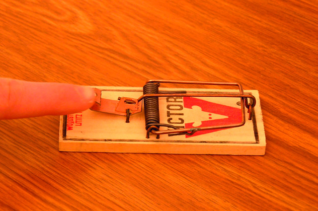
Interesting shot and coloring. It doesn't convey the message of conflict by itself.
Post actions
That's potential conflict right there...
Post actions
arghh carefull those things hurt ....
Post actions
Okay, guess I see the conflict here but don't really find this very interesting to view. Technically, not bad at all and I can't fault it. I don't have a suggestion to improve this.
Post actions
Post actions
Post actions
Post actions
conflict would have been the finger in the trap, lol
Post actions
Nice wood, a bit bright and blurry though.
Post actions
too orange - color looks way off.
Post actions
overly saturated. finger's blurry.
Post actions
The first thing that struck me was the saturation...seems way high. The second was that it doesn't really fit the theme.






 Add photograph to your favorites
 Add photographer to your favorites


 Photographer found comment helpful.


