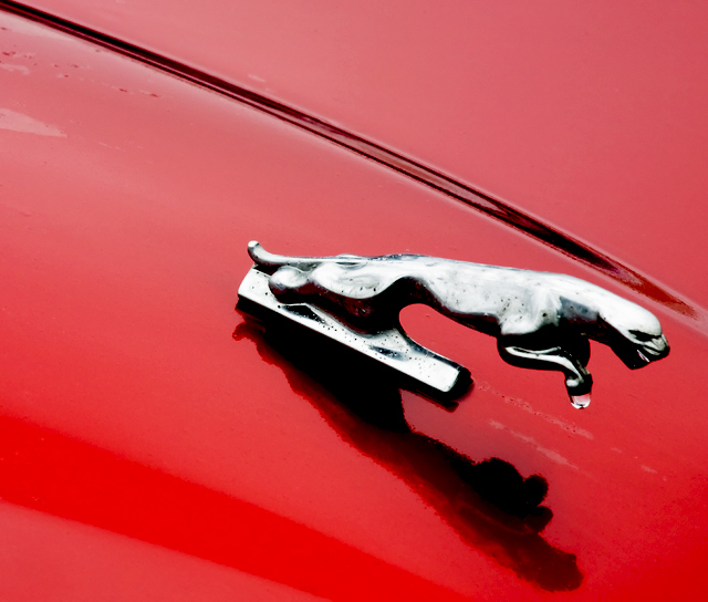
Stefan - I still for the life of me cannot figure out why this could possibly get a 4.89 as a final score. It is well composed, well exposed, interesting, creative and it sure seems like an automobile advert to me...
I shortchanged you during voting and only gave you a 7.
Nicely angled composition, and the drop of water on his paws is a nice touch. I think the cat could use a wee bit more room on the right to give him breathing room.
is that a drop of water there? If you would take a photo of your car's symbol, I would really wish you would dry it first :/ This is a nice photo, nice composition, colors and technically nice too... but it gives me the feeling of quick shot :/
Really nice lines and perspective on this shot - what a great brand image. The water is a nice touch. I just wish the Cat was a bit sharper and a bit more glossy looking
Always an iconic symbol - I wonder whether this is quite sharp enough though ? Also I think it might have benefitted from you crouching down to alter the angle of the shot ?
For my taste there are too many distracting factors: the reflections of clouds right underneeth the cat, the water drops on the top left, the 2 red shades on the left bottom. I am aware how dfficult it is to take a good shot of an emblem like this. You did well in not blowing out the bright areas of the cat too much.
This would have been much better had you found a leaper without rust pits. It also doesn't belong on the car that this is on. Sorry....I just know these cars too well. The crop's a little tight on the reflection, too, but I do like it that you did get it all.





 Add photograph to your favorites
 Add photographer to your favorites

 Photographer found comment helpful.


