I think a lot of people who voted on this challenge have some sort of love affair going on with cars in general. This makes some justice in my getting the brown ribbon, as I actively dislike them. They pollute and they kill.
Statistics
Place: 58 out of 60 Avg (all users): 4.0138 Avg (commenters): 3.9091 Avg (participants): 4.0500 Avg (non-participants): 4.0056 Views since voting: 1260 Views during voting: 393 Votes: 218 Comments: 30 Favorites: 0
I love this and the title is just funny. For some reason it brings to mind the Blues Brothers, I know not why. I can imagine a bumbling group of bumbling sited Mafia wannabes running towards those cars at any minute, scrambling for cash to pay the rental. I'm sure you could sell this idea to Hollywood.
Hey, you saw my comment! I loved it and gave you a 6. Way to go on your brown! LOL!!! I think with the title, anything with more flash would have been wrong. Too clever for DPC.
Hey, I like this image. I think it's a lot more interesting and creative than the high scorers. You deserved a different ribbon. Keep on truckin' and don't worry about scores. This is cool.
What's the matter with me -- I gave this shot a 7. It made me laugh. Perhaps without the title, I would have scored it lower, but I like what you did with the challenge.
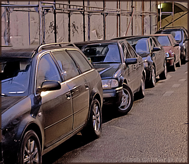
You definitely had the best title of the challenge and the processing added distinctly to the "anonymous" and "getaway" aspects of it. 'Grats on the brown!
Just a snapshot that doesn't say anything to me about the cars. Cutting the front of the first one in the row out brings this down, as does the scaffolding in the background. Maybe shot from a little more to the left in front of the car would have worked better. 4
i like the lines created by the wheels, the door panels, the windows, and the scaffold in the background. It pulls me in. However, the image seems a bit too blurry (probably the intent) but it does not work for me here.
I like the idea. Not all car ads have to be for new models. The image itself seems too medium toned throughout. Nothing really stands out to me. It also has the appearance of some blur or camera shake.
I find this picture not very attractive. I can't identify what actually is in focus. Somehow I get the impression this is not done intentionally. On the other side title and dull colors supplement each other.
I'm not sure if this was cropped and then enlarged, but it's very pixelated and heavily noisy, which distracts from the nice clean line you have here. The one wheel being turned out also challenges the symmetry. It's an interesting angle for a shot though and good job with composition.
Oh, this is just a hoot!!! LOL!!! Like a line of fleet cars! I really like the processing.....helps to make 'em look that much more nondescript. "I dunno, Officer, they just drove off in a brown sedan." LOL!!!
You see to have a bit of camera shake or motion blur here which unfortunately is the first thing hit me, secondly was the colour scheme - all the cars look the same colour and seem to blend in with all surfaces of the location. I would normally expected to see a single clean car in an advert, rather than many cropped/obscured ones.
Not sure if the post process is of or the focus of the original shoot, but it is to blurry for my taste. There is no clear focus for me to make it a car ad. IMHO -4-





 Add photograph to your favorites
 Add photographer to your favorites

 Photographer found comment helpful.


