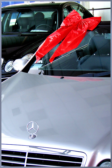
nice colors here. The angle of the shot is not so good. I don't like the idea the mirror and headlight of the other car kissing. Hood is clean, not much reflection. not bad overall :)
Angle is too confusing, not sure which car we're looking at, and both the reflections on the hood and the bright plastic bow detract from the image imo. 3
Really cool idea - the bow is a nice touch. However, I am really not sold on the crop and angle. The grill and headlights of Mercedes are so dramatic, by cutting them off, I feel we are missing a lot of the beauty of the car. In addition, there is a lot of 'blank space' on the hood of the car where we see a pretty unattractive ceiling.
I actually find this photo a bit funny...they want to sell you a car that expensive and they put a cheap plastic "dollar tree" bow on it...lol. great comp and all that...I think a white border wouldve set this off a bit better (IMO)good luck
~~Cher~~
Having 2 cars in the frame here is very distracting, and the large expanse of bonnet doesn't work for me. Maybe a lower viewpoint, focussing more on the Benz logo would work well. The red ribbon is a nice addition.
Ah the bow. Nice separation of color with the red of the bow. I think that the composition of the shoot could be a little stronger, it look like it was just taken at a car dealer ship and not a specific setup for a car ad. IMHO -5-







 Add photograph to your favorites
 Add photographer to your favorites


 Photographer found comment helpful.


