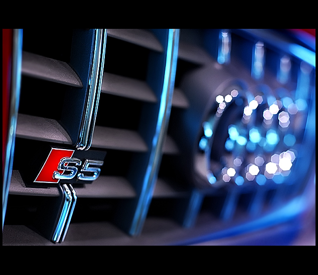
The Image: Shot in the Sydney Airport at the Qantas Club Lounge entrance, handheld. I like the Bokeh in this. I also like the blue. I had the white balance setting set to bring this out. I could see this on the front of a brochure as a teaser. Pity we couldn't add text to this challenge.
The Edit: Levels, Curves, Noise Ninja, a bit of dodging and burning and a colour adjustment layer to bring out the blues. A little blurring and sharpening.
Prediction: Probably won't get to 6 as I reckon there will be many great images. I hope 6. Some won't care for the border, but I think it adds.
Statistics
Place: 17 out of 60 Avg (all users): 6.0138 Avg (commenters): 7.0000 Avg (participants): 5.9500 Avg (non-participants): 6.0281 Views since voting: 1885 Views during voting: 411 Votes: 218 Comments: 27 Favorites: 1 (view)
I have to be honest, I really thought this should have been in the top 5. It is a very creative shot with cool lighting and excellent shallow DOF to tell the story. I think you were penalized for not having a specific car, but I think you nailed this.
Oh man... look at those bokeh :)I count 7 blades. Nice composition nice color nice lights. Although I love the bokeh here, I would rather see the AUDI symbol a bit more clearly :) Nice job overall :)
Nice detail shot that I could see being inset into a larger ad. I think Audi probably would want a much wider DOF, though, so its logo is as sharp as that S5 badge. 7
I would like a little more depth of field. The ornament in the grill for some will be obvious. I don't want it in focus, just a little less diffused. But I like it.
More branding than a specific car but still passes as an automobile advert. Perhaps Audi would have wanted their four-rings logo more visible and not disguised so much by bokeh. Not sure about the border, think you've gone for the widescreen TV borders.
Without the description, the blur on the Audi logo is a bit too heavy for many non-Audi enthusiasts to make out. I would give this one an 8 if the logo could be more recognizable.
Nice shot, I like the fact that although the audi logo is bokeh there can be no mistaking what it is (great creation of bokeh light polygons as well). Simple but effective I could not imagine this selling a car in itself but I could see it as a shot inside the brochure
Like the thick top/bottom border but not keen on the uneven left/right border which I think is a bit distracting and maybe could have been omitted
good color, good perspective, had been even better with a little less tilt to the left. like the bokeh, but DOF could be a little less shallow, too. border is a bit too bold for my taste.
Nice car !!! a great concept for a car ad for this automobile and good execution, the only thing I'm not fond of is that the DOF is so shallow that not even all of the "S5" is in focus which seams to be the main point for the shoot. IMHO 6





 Add photograph to your favorites
 Add photographer to your favorites

 Photographer found comment helpful.


