Camera:Kodak DC4800 Location: Kitchen table Date: Feb 18, 2004 Aperture: 1:3:0 ISO: 100 Shutter: 1/45 Galleries:Abstract, Black and White Date Uploaded: Feb 24, 2004
This was one of my other choices for the "mundane" challenge.
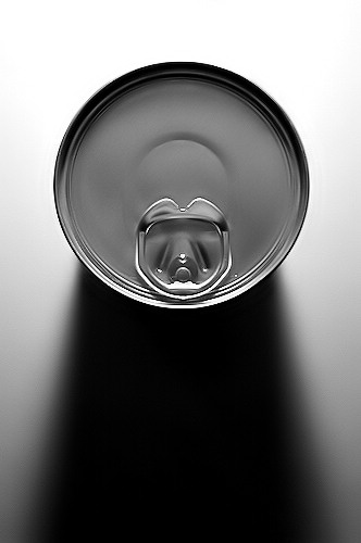
Just a can on white paper, with a light source behind it.
Greyscaled, adjusted brightness, contrast and the noise level.
I didn't sumbit this one because I feared people would think there was heavy ps involved. I do prefer this to the one I actually submitted. It has a nice graphic quality to it and is very simple.
hello. i think this shot fit's mundane challenge enough and would have done very well. I shure would give it a high 8 or up there. However, I want to say that this shot is very nicely done and adjusted to my taste. It flows very smoothly. At first, I wondered what it was. I like that. Shots that make you look twice and wonder. Also, it's a bit of an abstract. Which I love in photograghy. Those shots are a little harder to come by and/or shoot, without ripping them apart in Photoshop. :) Good luck on future entries.
Very effective use of light and shadow. For that I'd give it a 7. It's over sharpened as there are stair steps around the rim of the can. Super sharpness is not needed for a photo like this.
Great capture of an everyday item. Lighting is what makes this a nice simple composition. The thumbnail looks like a keyhole on a lock.Beautiful gradations of tone on the cans top. Good contrast on a B&W will usually receive bonus points from me, also good graphic images. "9" or "10", but probably a "10".
I looked over the submissions for the mundane challenge and in my opion (take that as you may) this one would win in my book. Nice clean lines, very simple, the varying degrees of grey tones are working and the overall image itself is just beautiful. I did notice the little jagged edge on the upper and lower lip of the can that someone else had mentioned. I don't know what the cause of that it is but if you can get rid of that the image would be a ten in my opion (again, take that as you may) and I almost never give out tens. Good work.
I think this definitely would have been about a 7 for me. I like how clean it is and the sharpness around the edges of the can. The gray tones are very nice and the composition is classic. Good, strong shot.
I like the clean lines, the position of your subject, the B&W treatment, doesn't strike me as over PSed (little jaggy on lower left lip),meets my criteria for a 6-7 (a mundane item that looks more interesting to me than when I see it day-to-day). Since I don't know which shot you did enter - hope that feedback helps in some way.
Nice sharp focus. I like the shadow too. I would have given it a 7, at least.
I noticed in your comments, you liked this better, but didnt post because you thought people would think it was too PSed. First, I don't think it looks too PSed at all. Secondly, screw the voters, do what you like. :-)




 Add photograph to your favorites
 Add photographer to your favorites


 Photographer found comment helpful.


