Author Thread
Post actions
Very creative shot! m8. I had this pegged for a top25 for sure. Really admire what you can with your SP's.
Post actions
ah, it's yours. I thought that, but wasn't sure. I like your photos a lot. thought it would do better.
Comments Made During the Challenge
Post actions
oh, cute!!! like that idea!
Post actions
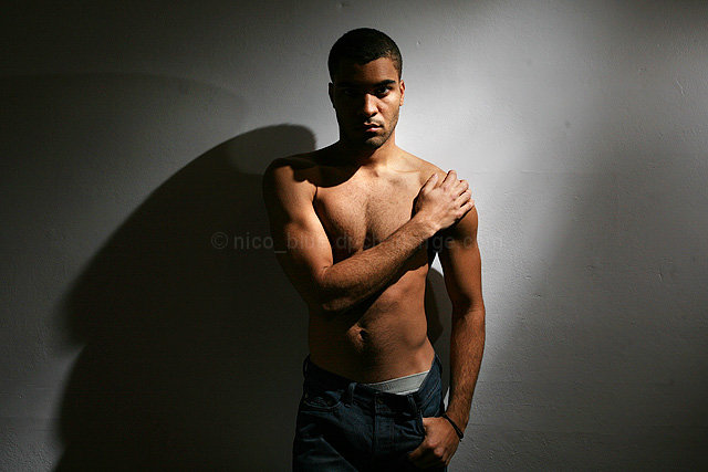
Cool use of lighting and shadows. Nico_blue, right? Great shot.
Post actions
I think the shadows are too strong. You could have added a slight light to them to make them disappear without actually lighting up the scene, depending on your shutter speed.
Post actions
I'm not crazy about the shadow on the wall, moving yourself away from it would have fixed this. But the lighting and pose are spot on.
Post actions
You could crop the entire right side of the photo ad not lose anything of interest.
Post actions
The title lifts this for me. Clever title
Post actions
I like the lighting, posing focusing... but the background... I wonder if you had a brick background... actually, either flat white background or some of the paint on this wall fall off and you can see the bricks behind it? It's a good photo overall :)
Post actions
Cool lighting. Looks like a very dramatic underware ad.
Post actions
Post actions
Post actions
I love it. And i may try to copy it with two lights (for two wings) for the "heaven" challenge.
Post actions
Interesting shadows here and I'm a big fan of off camera lighting. Definitely the way to go. Nicely done. BB
Post actions
Post actions
Ahh.......tongue hanging out! Very cool shadows and lighting. Is that sensor dust or spots on the wall though?
Post actions
I like the idea alot, you could have taken advantage that this was under advanced editing and exagerate a bit more with the shadows, I think a simple bump in contrast would have made this alot more powerful!
Post actions
oh wow, I didn't catch that on my first look... nice!
Post actions
Nico, good to see you back at DPC. I really like your lighting and pose. Composition could be a bit tighter around your right side IMO. Nice work man.
Post actions
A little more light so that we could see both eyes would be a little better, also too centered.
Post actions
Post actions
Odd lighting, since almost your whole body is lit, but your face is 1/2 in shadow.
Post actions
Very nice lighting, I like the centred shot and the stark background, it gives it alot of impact imo.
Post actions
like the lighting, but not the shadow created. Maybe be further from the background nextime? I don't normally like a centered composition, but it works here.
Post actions
Post actions
Great job except maybe shoulda cropped into portrait orientation.
Post actions
eyes are drawn to waist, away from face = not a good thing w/ a portrait. Arm going across body divides you into two zones, and the greater contrast is in the lower half. Effective if it's a hanes ad, but not as a portrait.
Post actions
nice lighting, wel thought of.
Post actions
like the mood and colors of the image, although not sure about the composition
Post actions






 Add photograph to your favorites
 Add photographer to your favorites


 Photographer found comment helpful.


