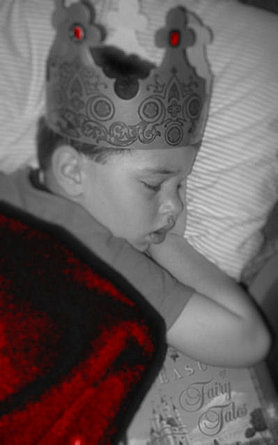
Well, here's my two cents. Some more contrast might help this out a bit, and perhaps a different point of view as well. I personally don't care for the selective desaturation here, IMO the colors don't help the photo. But good try though, and neat idea! :)
Quite a strange depth of field effect you have going on but the face is in focus which is the important thing here so thats good. Not sure the red colouring works, normally you would have single coloured objects in a mostly mono image to draw attention, but here, the red elements are not in focus and the main points of interest given you title and the brief should be the boy and the book which are left mono. So your intention by doing this colouring seems a little confused. Mono tones could have been pushed harder as they are a little washed out
Seems to be a tad oof? I guess the fairy tales book under his arms adds something to it, not sure how it will do as people will want to see a story more of such






 Add photograph to your favorites
 Add photographer to your favorites


 Photographer found comment helpful.


