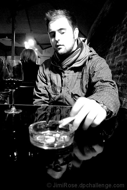
The dark reflection of the subject's face hints at an unseen menace...
This shot has a high contrast red filter on it, as well as some colour correction pre black and white-ing. It was shot under the light of a heating lamp (turns out it gets really cold in Italy this time of year!).
Statistics
Place: 90 out of 109 Avg (all users): 4.8936 Avg (commenters): 5.4000 Avg (participants): 4.4091 Avg (non-participants): 5.0417 Views since voting: 843 Views during voting: 310 Votes: 188 Comments: 11 Favorites: 0
I do like the image, but I agree with Jason that the contrast may be pushed just a bit too much. The face and hand are overly distracting and keeps the eye in that one area rather than allowing it to wander through the image. Overall, it really isn't a "DPC Friendly" image. Voters here like sharp images with too much noise reduction that are full of vibrant colors, for the most part anyway. I'm not an average DPC voter, and I gave it a 7 in voting. I also agree with Jason that taking the hot lights out of the composition would have helped a bit, too.
Technicals: While I think you were going for high-contrast, I think you might have overstepped by a small amount. The borders of his face almost seem to bleed onto his hair (something that can be an issue with red on a digital sensor). The biggest thing I would change would have been to try to compose the shot so the lights in the background were blocked. They distract us from the main subject. Otherwise I like your composition a lot.
The feel: subtle. It may be too subtle for DPC. I missed the "reflection" at first until you pointed it out. After you did, I like the idea a lot. Creative.
B&W was a good choice for this. Sets the mood nicely.
High contrast with hot highlights usually will not fare well here at DPC. While it may be an artistic expression, some will see it as a techical failing.
Since the challenge was run under the advanced rule set, I might have cloned out the lights in the upper left above the head of the person in the background. It pulls the eye away from your subject.
Other than that, if this is the effect you were going for, then you were successful. If you are trying to score higher, be careful of the extremes in contrast.
Very interesting shot, i really like the high contrast, i think it scored poorly because some people didn't think it really fit the challenge all the well. I like the subtle relation to the challenge, but most people like a very obvious relation, thats just how it goes here. I personally like the shot however, it has a great feel to it.
Absolutely fantastic image. I agree with Louis that the score is a disgrace; if I had seen this at the time I would nominated you for an OOBIE. For me it fits the theme perfectly and in a very imaginative and intriguing way. I would have given this a nine or ten, depending on my mood when I saw it. Excellent shot, with no suggestions for improvements (it's great as is).
Meh, this is an awesome portrait, and in my opinion perfectly composed. It's dark and edgy and reeks of story. The score is a disgrace. This is deserving of way more 6+ votes.





 Add photograph to your favorites
 Add photographer to your favorites

 Photographer found comment helpful.


