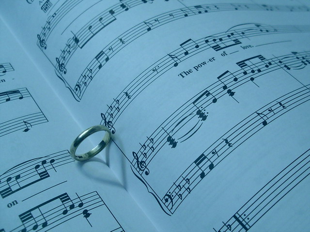
hmmm... i've seen this a few too many times. Nicely done though, and it's one of those pics that if it was shown anywhere other than DPC, would get a lot of respect. As it is, i'd say it needs more contrast, and instead of a blue tint, maybe an orange or something to warm it up because after all, love is not meant to be cold.
I think I would like this better if the white balance were adjusted to get rid of the overwhelmingly blue cast. Not really an uplifting color ... although I suppose you could have done that intentionally as a counterpoint to the heart and happy-sounding lyric. But then I would expect a title to hint at such an interpretation.
I have seen this type of image before but not with this sheet music. I think it might have been a little better if the paper was white and not blue. its a neat little trick with that shadow :)
This has a really blue tone to it, which makes it feel cold.. Maybe some white balance or a filter added to warmen in up would have made it better for me. imho.. Love is red, hot and passionate.. 5







 Add photograph to your favorites
 Add photographer to your favorites


 Photographer found comment helpful.


