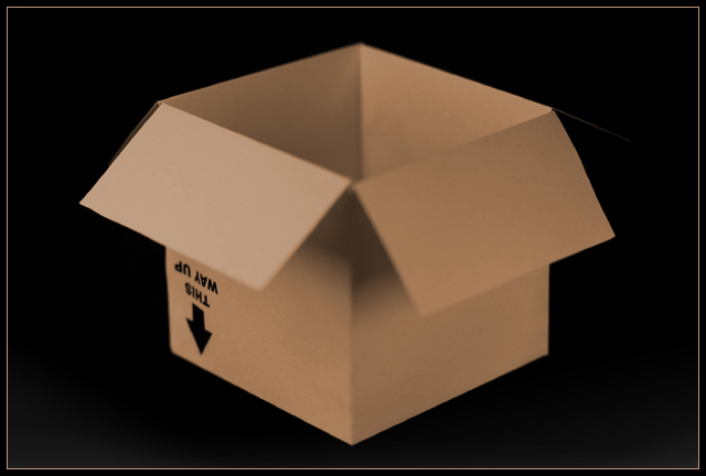
Yup, that's what it is. the focus is rather soft on the flaps. the lighting is very good. the composition is static because of the centre placement of the subject in the frame. The subject still looks like a plain old ordinary storage box.
Really a good idea for the challenge.....but this appears very fuzzy/OOF. Soft filter/lens? Just doesn't work for me on a shot of a cardboard box. Sorry, wish ya luck in the challenge.
I think your chosen depth of field actually works against this image: i don't seen the real benefit of stressing those particular angles of the flaps against the rest of the box. Sure, the text is ;egible, but as a point that would stand out against the regularity of the rest of the box, I don't think it neededd to be accentuated this way - for me, it only leaves the rest of the image to seem odd, as opposed to 'extraordinary'.






 Add photograph to your favorites
 Add photographer to your favorites


 Photographer found comment helpful.


