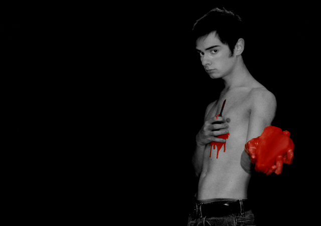
yeah, this was a tough one! the "heart" is crumpled up paper inside of a sock that i shaped into a heart and covered with "blood". the "blood" is hair gel with red ink. i had to select the blood and change it's color with hue/saturation to make the shade more realistic. i also used dodge and burn, unsharp mask, convert to black and white, and a blur tool. i think it turned out pretty good, but i also wish i could have done better. my camera died after three shots, and there was no way i could have simply charged it for more :). plus, i'm still red all over ;P. lighting was poor, otherwise i would have had the aperature at about 16 so the heart would have been more in focus. there was a lot of grain too, but i think that's been pretty well taken care of.
Statistics
Place: 134 out of 241 Avg (all users): 5.5443 Avg (commenters): 6.3000 Avg (participants): 5.2931 Avg (non-participants): 5.6984 Views since voting: 1123 Views during voting: 537 Votes: 305 Comments: 26 Favorites: 2 (view)
I'm not crazy about the execution, but I do like the concept. I think I'd prefer it with higher contrast and the red toned down to just subtly colored instead of garish. But hey, it's your shot - do what you like!
I am not a fan of selective desat - this done in pure B&W would be so much stronger because it would be more subtle. Right now it's clubbing me in the head - ouch.
Really bad photograph, really bad photoshop, really bad composition...but good concept. And concept is almost 99% of what makes a photograph good. Well including all that other stuff. So lets say 50%...
I don't know if you've heard this but in this particular image you look just like Billie Joe (lead singer of Green Day). Interesting selective desaturation. BB






 Add photograph to your favorites
 Add photographer to your favorites

 Photographer found comment helpful.


